The Signal Is the Stage: Designing Brand Motion for Britain's Crowded Phone Screens
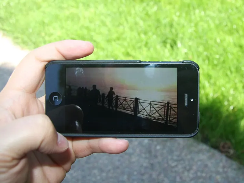
Photo: Intel Free Press, CC BY-SA 2.0, via Wikimedia Commons
There is a specific kind of disappointment that comes from watching a beautifully graded brand film turn to mush on a phone. You have seen it on the calibrated monitor. The type is crisp. The grade is rich. The transitions land. Then someone opens the same file on a three-year-old handset, standing on a crowded platform with one bar of signal, and the whole thing looks like it was encoded by a fax machine.
The idea has not failed. The delivery has. In 2026, UK mobile networks are fast in the right places and frustratingly uneven in the wrong ones. Crowded 4G cells, capped data plans, low-data modes, sunlight bouncing off screens and apps that autoplay muted video in a tiny window all shape whether the work actually lands. Bitrate planning deserves a place next to the storyboard and the colour test. At NovaGFX, the studio monitor is only the first checkpoint.
The Worst Screen Is the Real Screen
Most motion work is still reviewed in conditions that flatter it: large display, reliable Wi-Fi, decent speakers, controlled light. That is useful for craft. It is not useful for predicting impact. The real viewing environment is a phone held at arm's length on a train, in a queue, on a high street, or on a sofa with the brightness turned down because someone is half-watching.
The practical move is to build a small device matrix and treat it as part of the review process. Include an older iPhone, a mid-range Android handset, and whatever phone is closest to the office kettle. Test on a throttled connection, not just office Wi-Fi. Watch in daylight. Watch with the sound off. Watch for five seconds, then stop, because that is often what the audience will do.
Britain's Mobile Reality Is a Patchwork
Coverage across the UK is not a single story. A file that streams smoothly in central Manchester may stutter on a rural train line. A campaign that looks sharp on a flagship handset may look soft on a cheaper model with a smaller screen and different scaling. Network congestion around stations, stadiums and event days can make a fast connection behave like a slow one.
That does not mean designing for the worst-case scenario and abandoning ambition. It means accepting that the network will choose which version of the film many people see. Adaptive streaming will drop to a lower rung when bandwidth tightens. If that lower rung destroys the message, the concept was never as robust as the pitch deck suggested.
Compression Is a Design Material
Compression is not a post-production afterthought. It is a material condition, like paper stock or screen resolution. It punishes certain choices and rewards others. Fine gradients can band. Subtle grain can turn to blocky noise. Thin type can shimmer. Fast cuts can smear into a single blur. Slow, low-contrast fades can become a grey soup.
That is not an argument for bland work. It is an argument for building compression-safe impact. Chunky type, strong silhouettes, deliberate holds and high-contrast edges survive the journey better than fussy micro-detail. A bold colour block will often read more clearly on a low bitrate than a delicate texture. A clean cut will often hit harder than an elaborate transition that needs every frame to survive intact.
The useful test is simple: encode the film at the bitrate you expect on a middling mobile connection, then watch it on a phone. Not on a desktop player. Not at full size. On the phone, in the hand, in normal light. If the idea still lands, the design is doing its job.
Set a Weight Budget Before the Edit Locks
File weight is easier to manage when it is treated as a budget rather than a surprise. A 15-second vertical paid social cut might need to sit comfortably under 3 MB. A 30-second film might have a starting target under 8 MB. Longer brand pieces can carry more, but they still need a low-weight version for places where data is tight or patience is short.
Those numbers are not universal laws. They are starting points for a conversation between creative, production and media. The important part is deciding early what the delivery ladder looks like. Which codec is the compatibility baseline? Where can a more efficient codec be used? What is the poster frame? What does the first second look like before the video has properly loaded? What is the low-data cut, and does it still feel like the brand?
A Practical Checklist for Shipping Impact
- Design the first frame as a poster, not an accident. It should sell the film before motion begins.
- Make the first 1.5 seconds legible as a still. Many viewers will see little more.
- Keep type large, high-contrast and tested in sunlight. Thin weights are a luxury the network may not afford.
- Avoid dense grain and slow gradient ramps unless you have checked them after encoding.
- Provide a muted-first version with captions or on-screen text. Sound should add, not carry.
- Build a low-data cut that preserves the core idea rather than simply shrinking the master.
- Test on real devices and throttled connections, not only on a studio display.
- Include a reduced-motion option where the platform or audience needs it.
- Check the lower bitrate rungs of the adaptive ladder. If the message disappears there, redesign the hierarchy.
Let the Network Pick the Cut, Not the Concept
Adaptive delivery means the audience may never see the pristine master. They may see the 800 kbps version, or the 400 kbps version, or a poster frame while the connection catches up. That is not a reason to give up on visual ambition. It is a reason to make ambition resilient.
The strongest mobile work tends to have a clear hierarchy: one idea, one focal point, one reason to keep watching. When that hierarchy survives compression, the film still feels like the brand even when the details soften. When the hierarchy depends on a hairline stroke or a subtle texture, the network gets a vote it should never have had.
High impact is not the same as high bitrate. It is clarity that survives the journey from studio to pocket. The bitrate test belongs in the studio, alongside the colour test and the sound mix. Treat it as a creative constraint, not an admin task, and the work will hit harder exactly where it matters: on the screen people are actually holding.