Peripheral Vision Is the Brief: Designing Motion for UK Stadium Screens
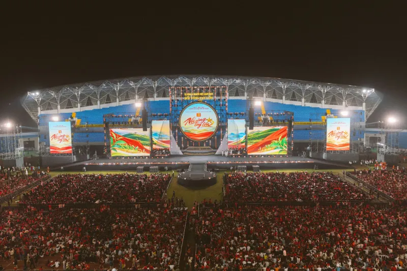
You don't watch a stadium screen. You glance at it. Mid-chant, mid-pass, mid-walk to the concourse. That distinction — glance versus watch — is the whole job.
The desktop timeline is a lie
Most motion design is judged on a desktop timeline at 100% zoom. A stadium LED screen is judged from 20 to 80 metres away, at an angle, while someone is walking to a concourse or filming a corner on their phone. A 10mm pixel pitch at 40 metres is roughly the resolution of your thumb at arm's length. Fine detail disappears. Drop shadows become mud. One-pixel outlines turn into flicker.
The first rule of stadium motion: design for the worst seat, not the showreel. That means fewer elements, higher contrast, and a clear focal point that reads in under a second. If the graphic needs a caption to explain it, it's already lost.
Refresh rates, shutter speeds and the 50Hz rule
UK broadcast runs at 50Hz. Cameras shooting football typically use a 1/50 shutter, sometimes 1/100 or 1/60 depending on the rig. If your LED content has motion that doesn't align with those multiples, you get banding, strobing or that faint rolling bar on Match of the Day. The fix isn't a post-production filter; it's designing motion on timelines that respect 50Hz and testing with a camera, not just a monitor.
Most high-end stadium LED cabinets refresh at 3,840Hz or higher, but that doesn't make bad motion good. A slow two-second gradient sweep can still strobe if it's timed at 60Hz on a 50Hz system. Build a 50Hz preview export. Watch it on a phone at 1/50 shutter. Then watch it on a broadcast monitor. The difference is humbling.
Camera-safe zones are not optional
Broadcast framing crops your canvas. A 16:9 screen might be shown in a tight shot during a replay, with the lower third covered by a score bug. Sponsor logos in the bottom-right corner vanish. Animated tickers along the edge become a blur. If a brand has paid for placement, it needs a safe zone — typically 10–15% inset from each edge, sometimes more for pitch-side halo boards.
Halo boards are the extreme case. They're a metre high, 100 metres long, viewed at a grazing angle by fans and head-on by the main camera. Motion that travels horizontally becomes a speed blur; motion that pulses vertically reads better. Text should hold for at least two seconds, and logos should sit in the centre third of the board's height. The camera is the client, even when the crowd is the audience.
Sponsor legibility is a physics problem
Contrast ratio, font weight, hold time. That's the trinity. Thin type disappears at distance. Gradients reduce contrast. Busy backgrounds fight the logo. The best sponsor idents in UK football are almost boring up close: bold wordmarks, flat colour, a single clean move. They look simple on a desktop. They look expensive from row 52.
A practical rule: no more than two lines of text, no more than six words per line, minimum two-second hold. Animation should resolve into a static frame that can survive a freeze-frame on a replay. If the graphic only works while moving, it doesn't work.
Design for the corner of the eye
Peripheral vision is motion-sensitive and poor at detail. That's why a stadium screen can get away with huge, slow gestures and bold silhouettes. A hard cut from red to white will register from across the pitch. A 12-point caption will not. Use luminance contrast first, colour contrast second. Test in greyscale. If it reads in greyscale, it'll read in a crowded stadium.
Motion should be slower than you think. A one-second move on a desktop feels punchy; at 50 metres it feels frantic. Two to four seconds is often the sweet spot for transitions, with longer holds for any text. Ease-in and ease-out curves need to be exaggerated, because the eye is tracking movement across a wide field. Linear moves look mechanical; sharp springs look glitchy.
The crowd is the content
Fan cams, birthday messages, half-time quizzes, sing-along lyrics. These are the moments people actually film. They need a different design language: bigger faces, simpler frames, fewer brand elements. Latency matters. If the fan cam is six seconds behind the crowd, the joke dies. Build a separate template kit for live capture, with a producer-friendly interface and a clear queue.
Moderation is part of the design. A message that looks fine on a phone can be unreadable on a screen. A logo that works in a sponsor bumper can clash with a fan's shirt. Give the live operator guardrails: safe zones, pre-approved fonts, and a hard limit on text length.
Test in the real world, then test again
Commissioning is where stadium motion earns its keep. Walk the stands. Stand in the corner. Watch the screen from the concourse TV. Film it with a phone at 1/50 shutter and watch the playback. If the motion banding is visible on a phone, it'll be visible on broadcast. If the sponsor logo disappears at the edge of the frame, move it.
The best stadium motion designers keep a worst-case checklist: 80-metre viewing distance, 20-degree angle, 50Hz refresh, 1/50 shutter, compressed broadcast stream. If the graphic survives that, it'll sing in the stadium. If it only works on a Retina display, it's not stadium motion. It's a showreel with a big screen attached.
What changes in 2026
More UK grounds are upgrading to curved LED, transparent ribbons and pitch-side halo boards with higher refresh rates. Broadcast AR overlays are creeping into pre-match shows. But the fundamentals haven't moved: design for the glance, respect the camera, and treat the sponsor's logo like a physics problem. The screen is big. The attention isn't. Act accordingly.