The Grid Under the City: What UK Wayfinding Can Teach Motion Designers About Clarity at Speed
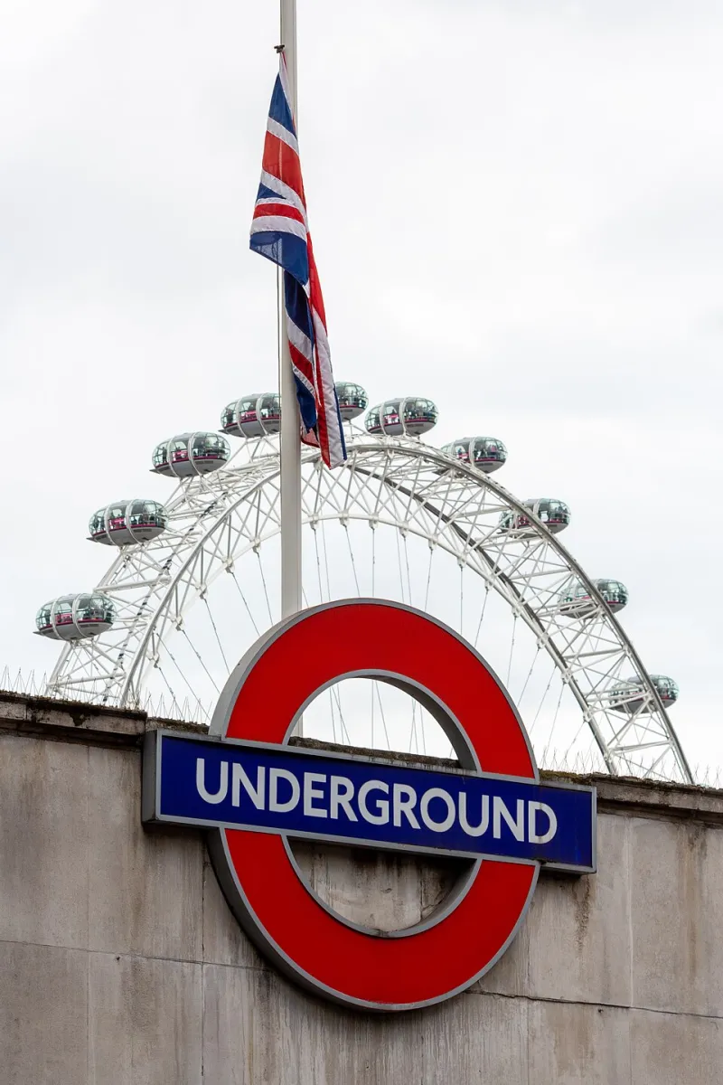
Photo: The wub, CC BY-SA 4.0, via Wikimedia Commons
Ask a motion designer what they admire about British wayfinding and you will often get a predictable answer: the roundel, the motorway gantry, maybe the old British Rail pictograms. All fine references. But the real lesson is not visual. It is systemic. UK public-information design grew up solving a brutally practical brief — move large numbers of people through complex spaces without confusion — and that discipline maps almost perfectly onto motion work for brands.
A century of designing for the glance
London Transport’s early design programme, shaped by Frank Pick, treated signage, type, maps and architecture as one joined-up system rather than a pile of separate assets. Harry Beck’s tube map famously threw away geography to make the network easier to read. Later, Jock Kinneir and Margaret Calvert’s motorway signage system gave Britain a modular alphabet and layout logic that still works at 70mph. NHS wayfinding, meanwhile, has spent decades trying to make hospitals legible to people who are already stressed, late and unsure where they are going.
None of that is nostalgia. It is evidence of a design culture that values the second glance, the bad lighting condition, the hurried user and the exception case. Motion designers should be stealing that mindset far more often than they steal the roundel.
Clarity is a modular system, not a style
Wayfinding works because it is assembled from repeatable parts: a type scale, a colour code, arrows, pictograms, spacing rules and a consistent relationship between those elements. Change the destination and the system still holds. That is exactly how a motion system should behave.
Too many brand films are built as one-off frames. Each scene is bespoke, each transition is a flourish, and by the third week of a campaign nobody can remember which rule applies where. A wayfinding approach asks for components instead: title cards, lower thirds, caption behaviours, transition logic, colour roles and timing rules. Build those once, test them hard, then let the content change.
As one London-based wayfinding designer puts it, the job is not to make a beautiful sign. The job is to make the next hundred signs obvious. Motion directors would do well to repeat that sentence before opening After Effects.
Design for the glance, not the frame
People read signs at speed. They do not study them. Motion audiences behave the same way: they are scrolling, half-watching, muting, glancing up from a phone while the kettle boils. A title sequence that only works when watched full-screen with sound is a wayfinding system that only works in daylight.
UK motion directors increasingly stress-test work at quarter speed, at thumbnail size and with audio off. That is the motion equivalent of checking a sign from the far end of a platform. If the hierarchy collapses, the system is too delicate. If the meaning depends on a decorative transition, the transition is doing too much work.
Colour should have a job description
In wayfinding, colour usually means something: a line, a route, a zone, a status. It is not there to add mood. Brand motion often uses colour the other way round — as atmosphere first and information second. That is fine until the palette has to carry meaning across a campaign.
A stronger approach is to give every colour a role. One for primary message, one for secondary information, one for alerts or calls to action. Pair colour with shape, type or motion so accessibility does not depend on hue alone. Then stress-test it against the messy real world: small screens, low contrast, colour-blind viewers, compressed video and whatever codec the media agency insists on.
Borrow the thinking, not the roundel
Several UK studios have started using wayfinding logic in title sequences and brand films without copying the visual furniture. You see it in modular chapter cards that behave like station signs, in transport-style lower thirds that prioritise destination over decoration, and in colour-coded sequences that let viewers orient themselves without thinking.
The pastiche version is easy to spot: a red circle, a sans-serif that looks vaguely like Johnston, a knowing nod to the Northern line. It usually feels like a mood board rather than a system. The better version borrows the rules — hierarchy, repetition, exception handling, restraint — and leaves the historical costume behind. It also avoids licensing headaches and the slightly awkward feeling of using a public transport identity to sell a soft drink.
Practical takeaways for motion systems
- Build a component library before you build a hero frame. Title cards, captions and transitions should be reusable, not artisanal one-offs.
- Write down the hierarchy. What does the viewer need in the first half-second, the first two seconds and the first five?
- Test at speed, at thumbnail size and with sound off. If it fails, simplify the system rather than adding more motion.
- Give colour a semantic job and never let it carry meaning on its own.
- Design the exception case: long words, short deadlines, localised copy, vertical crops and accessibility requirements.
- Keep a house style guide that is short enough to use. A twenty-page PDF nobody opens is not a system.
British wayfinding is an underused creative reference because it is profoundly unglamorous in the right way. It cares about the person who is lost, hurried and not particularly interested in design. That is not a bad brief for a brand film either. The best motion systems do not shout about their cleverness. They quietly get people where they need to go.