Silence Is a Design Constraint: Seven Rules for Muted-First Brand Motion
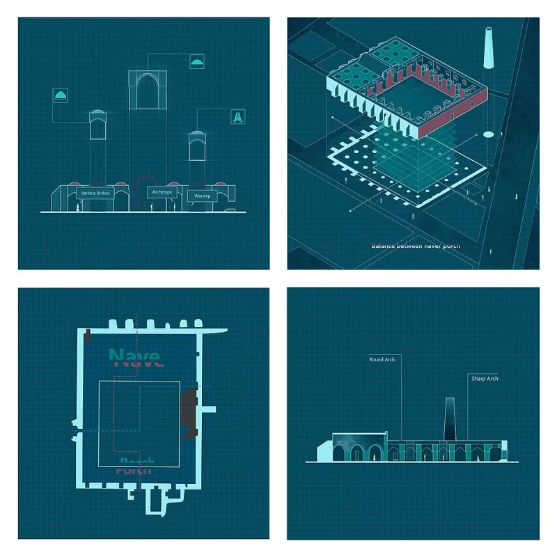
Photo: Mohammdrza Mahmoudi, CC BY-SA 4.0, via Wikimedia Commons
The mute button is not an accident. It is the default. In 2026, a brand film is just as likely to be watched on a phone in a queue, on a screen above a ticket machine or on a digital out-of-home site across a train platform as it is to be watched on a telly with the volume up. That changes the brief. Sound is a bonus, not a guarantee.
For motion designers and VFX teams, this is not a reason to mourn. It is a design constraint, and constraints are useful. The best muted-first work is often sharper, clearer and more memorable than the version that relied on a voiceover to do the heavy lifting. Here are seven rules that hold up in the edit suite and in the wild.
1. Design the first frame as a poster
If someone pauses on frame one, the ad should still say something. That sounds obvious, but a lot of motion work opens with a logo, a blur or a slow reveal that only makes sense after ten seconds of build-up. In a feed, you have about a second. In digital out-of-home, you have whatever time it takes someone to walk past.
Think of the first frame as a poster with a job to do. Aldi's Kevin the Carrot works because the silhouette and the carrot nose read instantly, even before the song kicks in. Specsavers' visual punchlines often land because the gag is set up in a single readable image. Compare the Market's meerkats have the same advantage: you know the brand before anyone speaks.
2. Let kinetic typography carry the message
Type is the most reliable sound-off tool you have. It can deliver the offer, the joke, the product name and the call to action without a single line of dialogue. The trick is to treat type as image, not as a transcript.
Short words. Big scale. One idea per card. Timing that matches the rhythm of the edit. If the type is doing the work of a voiceover, it needs to be readable at a glance, not just pretty in a portfolio. The best kinetic typography has a bit of personality, but it never asks the viewer to work too hard.
3. Build a visual hierarchy that survives a squint
The squint test is still one of the cheapest and best tools in the studio. Squint at the frame. Can you tell what the product is? Can you find the logo? Can you see the offer? If the answer is no, the hierarchy is not doing its job.
Muted-first motion needs one focal point per beat. That might be the product, a face, a piece of type or a visual gag. Everything else is support. The mistake is animating everything at once and hoping the viewer will find the important bit. They will not. They will scroll.
4. Use motion to direct the eye, not to decorate
Motion is a pointer. A reveal, a match cut, a directional wipe, a change in scale: these are all ways of telling the viewer where to look next. If a move does not do that, it is probably decoration.
A useful test is to watch the film with no sound and trace your own eye path. Did you look at the product when the product mattered? Did you find the logo without being told? Did the transition help or did it just look nice? The answers will tell you whether the motion is doing editorial work or just filling time.
5. Bake accessibility in from the start
Accessibility is not a post-production checkbox. It is a design decision. Contrast ratios, caption placement, flashing, legibility and reduced-motion options all need to be considered before the first frame is animated.
Captions are not just for speech. They can carry sound effects, music cues and off-screen action. If there is no speech, consider whether the visual story needs a text layer at all. If there is speech, make sure the captions are readable on a phone and do not cover the product. Avoid rapid flashing, especially in digital out-of-home where the screen may be close to the viewer. And where you can, respect reduced-motion settings; not every viewer wants the full fairground ride.
6. Test in the actual feed, not in the edit suite
The edit suite lies. It has a big screen, good speakers and no distractions. The feed has a thumb, a glare and a hundred other things competing for attention.
Test on a phone. Test in a lift. Test on a screen across a train platform. Do the three-second test: what does someone remember after three seconds of muted playback? Do the thumb test: would you stop scrolling for this? Do the distance test: can you read it from the back of the room? Ask someone who has not seen the brief what they think it is selling. If they cannot tell you, the film is not finished.
7. Give silence a rhythm
Silence is not a void. It is a different track. Muted-first motion needs visual beats: cuts, holds, reveals, type landings, logo stings. The pacing should feel intentional, not like a music video with the sound turned down.
Let the logo land. Let the product breathe. Give the call to action enough time to be read. The best muted work feels like it was designed for silence, not deprived of sound. That is the difference between a film that survives the mute button and one that merely tolerates it.
The mute button is the brief
In 2026, the brand films that travel furthest are the ones that can be understood in a glance, on a phone, in a queue, with the sound off. That does not mean sound is unimportant. It means sound is a layer, not a crutch. Design for silence first, and the sound-on version will usually be better too. The mute button is not the enemy. It is the brief.