Dim Lights, Full Bar: Motion That Earns Its Place in Theatre Foyers
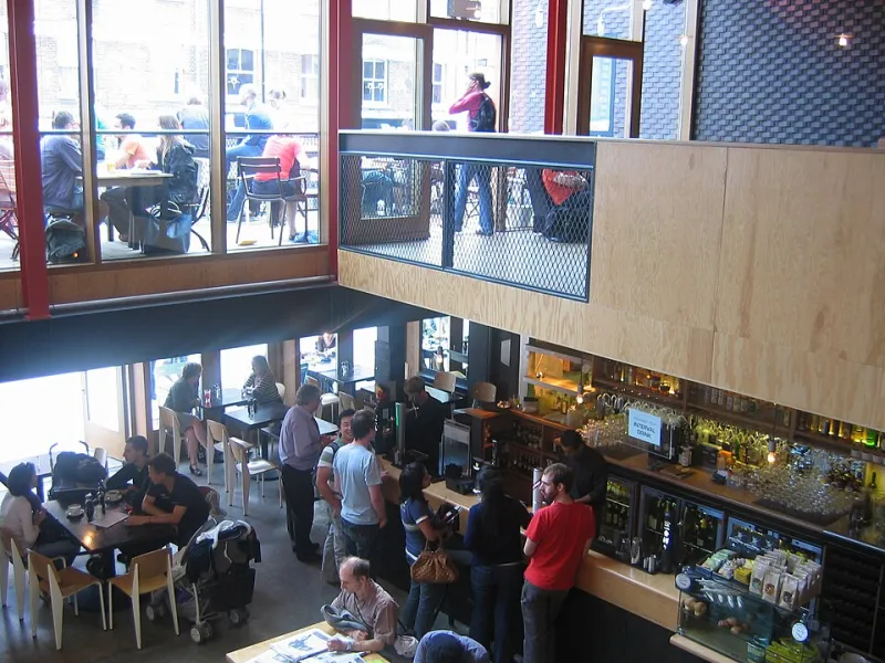
Photo: Secretlondon, CC BY-SA 3.0, via Wikimedia Commons
A regional theatre foyer at 8.40pm is a very specific room. The house lights are up just enough to see a glass of wine and not enough to read a paperback. The bar queue curls past a noticeboard. Somewhere above it, a screen is playing a trailer at shop-window brightness with no captions, while a hundred people try to stay inside the emotional world of act one. The screen is not the problem. The motion is.
Interval screens have quietly become part of the front-of-house furniture in UK theatres, from touring houses to receiving venues with listed plasterwork and no obvious place to put a telly. The temptation is to treat them like any other digital signage loop: bright, busy, branded, loaded with calls to action. That is the wrong brief. The interval is short, the audience is standing, the room is dim and the bell is the only deadline that matters. Design for that, and the screen becomes a good host. Ignore it, and you have built a second show nobody asked for.
The room sets the first rule
Most theatre foyers were not designed around emissive rectangles. They have low ambient light, warm finishes, awkward sightlines and often a listed interior that will not tolerate trunking, brackets or a 55-inch panel bolted to the cornice. The screen usually ends up on a freestanding plinth near the bar or the stairwell. That is fine, as long as the motion accounts for it.
Start with luminance, not brand colours. A loop graded for a bright office will glare in a dim foyer and wash out the room. Use an ambient light sensor if the screen has one, or set a conservative brightness cap and test it at 8.30pm with the house lights at interval level. Warm-neutral whites read better than pure white. Deep backgrounds with high-contrast type are kinder than full-bleed photography at maximum brightness. Anti-glare glass or a matte finish helps, but motion can do a lot of the work: keep large areas of the frame stable, avoid sudden white flashes and never use a full-screen luminance step to announce a scene change.
Sightlines matter too. If the screen is portrait, captions stack awkwardly. Landscape usually wins for text-led interval content. Mount it at eye level or slightly above, not high on a wall where people crane. And check the viewing distance from the back of the queue. If the type is not readable from there, the motion is decorative.
Muted-first is not a compromise
No one can hear the screen over the interval. Assume audio is off, always. That means captions are not an accessibility add-on; they are the primary design layer. Burn them into the video rather than relying on a player. Keep them to two lines, use a solid scrim or a clean lower band, and hold each line long enough to read at a glance. Four to six seconds is a sensible starting point for a short sentence; longer for access information.
Resist the urge to animate text word by word. Kinetic type is lovely in a title sequence and exhausting in a foyer. Let the words arrive, hold and leave. If you are cutting production photography, give the caption a stable background so it does not fight the image. And do not bury the useful stuff in a beautiful brand film. The audience needs to know three things: where the bar queue is shortest, when act two starts, and whether there is a relaxed performance or a BSL-interpreted night coming up.
Access notices deserve their own dwell time. Step-free access, hearing loops, audio description, accessible toilets and the location of the lift should be legible in a glance. Pair plain English with icons that match the theatre's existing house style. If the venue runs a relaxed performance, say what that means in one line. It is not a legal disclaimer. It is front-of-house information, and the screen is now part of front of house.
The bell is the real deadline
Interval lengths vary. A touring show might run fifteen minutes; a long musical might run twenty. Do not build a loop that assumes a fixed window. Build an interval mode with a hard stop. Four minutes before the bell, the screen should switch to a return notice: 'Act two begins in four minutes.' At the bell, it should stop selling and start directing. Any content that cannot finish before the bell should not start.
The practical answer is a modular loop rather than a single hero film. A ninety-second base loop can carry wayfinding, next season, access information and a bar message. Then schedule the blocks so the most useful items appear more than once. Next season at minutes two, seven and twelve. Access information at minutes four and nine. Return notice at bell minus four. A simple CMS or show-control trigger from the box office can handle this. If the venue cannot do triggers, a scheduled playlist with a hard stop is better than a clever loop that runs past the call.
Keep the motion language modest. Slow pushes, cross-fades, a held frame with a caption. No whip pans, no strobing, no rapid cuts. The screen is competing with conversation and a queue, not a cinema screen. At 25 frames per second on a 50Hz panel, motion is smoother and more predictable than 24p. Test it on the actual screen, not a desktop monitor. Consumer panels in foyers often handle gradients badly; banding in a dark background is a common tell.
Sell the season like a programme note
The commercial job is real. Regional theatres need bums on seats for next season, and the interval is a captive moment. But the tone should be closer to a programme note than a streaming ad. One production at a time. A slow push on production photography. A clear title, a date range, a short URL. Let the image breathe. If you use a QR code, make it large, high-contrast and paired with a short link for people who are holding a drink or standing at the back of a crowd. Do not ask the audience to scan, read and book while the bell is about to go.
Avoid comedy that undercuts the play. If the show has just delivered a devastating act one, a jaunty 'Book now!' animation will feel like a betrayal. Match the theatre's print tone. Match the typeface. Let the screen feel like it belongs to the building, not to a media agency.
Wayfinding is motion design too
Queues move in patterns. If the upstairs bar is quieter, say so. If the accessible toilet is on the ground floor, show the route. Use arrows that appear once and hold, not arrows that loop continuously. Continuous motion pulls the eye away from the bar staff and the people in front. A single directional cue that resolves is better than a permanent animation.
Keep the information architecture shallow. One screen should not try to explain the whole building. At most, three messages per block: bar, stairs, access. If the venue has multiple screens, give each one a job. The screen by the stairs can handle wayfinding; the screen by the bar can handle next season and access. Do not duplicate a busy loop across every panel.
Measure the useful things
Impressions are not the metric here. Ask front of house whether they are getting fewer questions about the accessible toilet. Watch whether the queue for the upstairs bar evens out. Put a unique short URL on the next-season card and count bookings. Ask a handful of audience members whether they noticed the relaxed performance notice. If the screen is doing its job, it will feel quiet and obvious. If it is not, people will complain about the brightness before they complain about the content.
The interval is a stage, but the performance belongs to the audience. The screen should be a host: dim enough to live in the room, captioned enough to include everyone, brief enough to respect the bell and useful enough to justify the electricity. When the bell goes, it should get out of the way.