The Museum Case Is a Hostile Screen: Motion for UK Heritage Vitrines
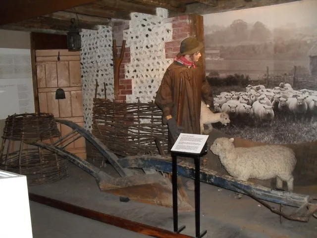
Photo: Basher Eyre, CC BY-SA 2.0, via Wikimedia Commons
There is a particular kind of optimism that leads a studio to install a bright, beautifully graded motion piece inside a heritage vitrine and then watch it turn into a grey mirror the moment the gallery doors open. The timeline looked sharp on the monitor. The glass, the spotlights, the polished floor and the visitor in a raincoat had other ideas.
Museums and heritage sites across the UK are full of these moments. A screen sits beside a fragile textile, a Roman coin or a taxidermy fox, and the brief asks motion to explain, orient or add atmosphere without stealing the show. That is a design problem before it is a rendering problem.
Start with the glass, not the timeline
The first useful test is not codec choice or frame rate. It is contrast behind glass. A deep black background inside a lit vitrine behaves like a mirror. You will see the gallery, the ceiling spots and the visitor's phone. Mid-tone backgrounds often hold up better because they give the reflection less to fight against. Pure white can bloom under conservation lighting. Saturated reds can smear on cheaper panels. The safe palette is usually the one tested in the room, not the one that looked punchy on an OLED in a darkened suite.
Take a greyscale ramp and a few type samples to the site. Put them on a portable monitor at the actual viewing distance, behind a sheet of the specified glass if you can get a sample. Check the screen at the brightness the museum will actually run it at, which is often lower than you expect. Conservation lighting can sit around 50 lux for sensitive objects and considerably higher elsewhere, but the screen has to work across both. If the type only reads when the gallery is empty and the spotlights are off, it does not read.
Design for the glance, not the gaze
A crowded gallery is not a cinema. People arrive mid-loop, read half a sentence, get called by a child and leave. Motion that depends on a three-act structure will be missed. A better pattern is a short, legible loop with one clear idea, a long enough hold for a slow reader and a transition that does not demand attention every four seconds. Think of it as exhibition wayfinding with a pulse.
The pacing should also respect the room. A quiet ceramics gallery does not want a strobing ident. A busy family-focused space can take more energy, but even there the screen is competing with objects, labels, architecture and other people. Motion should lower the cognitive load, not add another layer. If the piece works as a series of stills, you are probably close. If it only works when every frame is moving, you are probably overdesigning.
Accessibility is a gallery condition
Museum screens are often muted by default. Some sit in spaces where audio would be inappropriate, and many visitors will never touch an interactive. That makes captions, clear typography and a muted-first composition non-negotiable. Avoid relying on colour alone to carry meaning. Keep flashing and rapid luminance changes out of the piece, and test for photosensitivity before the conservator finds the problem for you. Give text enough time on screen for someone reading in a second language or at a distance.
Distance matters more than in a typical digital campaign. A label 30 centimetres from a visitor's face is a different object from a screen 2 metres away behind glass. Cap heights, line lengths and subtitle placement need to be checked at the real viewing angle. If the vitrine is low, visitors will look down. If it is high, they will look up. Both change how much of the screen is actually visible. A safe zone designed on a flat monitor can disappear behind a bezel or a reflection line.
Prototype in situ, then prototype again
The most useful tool is a cheap mock-up. Tape a piece of card to the glass at the planned screen size. Put a battery-powered monitor behind it. Watch people walk past. You will learn more in twenty minutes than in a week of studio reviews. Does the piece pull focus from the object? Does the reflection cut across the type? Do visitors stop at the right distance? Do they misunderstand the loop as an interactive and try to touch the glass?
Talk to the people who live with the building: curators, conservators, lighting designers, front-of-house staff and the fabricator who has to route the cables. They will tell you about heat, cleaning, dust, service access and the fact that the gallery gets direct sun in July. They will also tell you which objects cannot be moved and which sightlines cannot be blocked. That is not bureaucracy. It is the brief.
Let the object stay the star
Motion inside a heritage vitrine should feel like a good interpretation panel that happens to move. It should explain, frame or connect. It should not audition for a showreel. Use negative space. Keep brand motion recognisable but quiet. Give the object room. A slower reveal, a restrained transition and a well-set caption will usually beat another particle wipe.
Finally, plan for the opening after the opening. Content decays. Galleries are rehung. Lighting changes. A screen that looked perfect in February can look wrong during a winter evening event. Document the brightness, colour profile, loop length and file settings. Leave a simple update route for the museum team. The best motion work behind glass is the kind that still makes sense when the studio has gone home and the gallery is full of people who never read the brief.