When the Only Witness Is Tired: Designing Motion for Britain’s 24-Hour Rooms
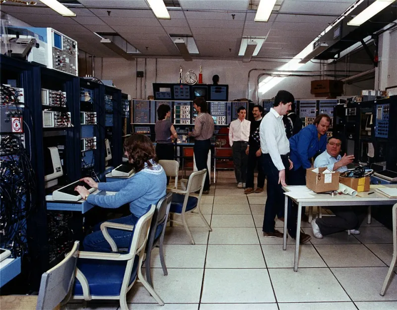
Photo: MIT PSFC photographer Ron Levenson, CC BY 3.0, via Wikimedia Commons
At 03:12 on a Tuesday, a signaller in a regional rail operations centre is not browsing. They are scanning. The room is dim, the wall displays are bright enough to sting, and the tea has gone cold. Somewhere on a desk monitor, a small status tile begins to pulse. If that pulse is the wrong shape, the wrong speed, or the wrong colour, it is either missed or it becomes noise. Either way, the motion has failed.
This is the audience nobody puts in the moodboard: the 24/7 operator. NHS bed managers, transport control staff, Highways England regional teams, security operations centres, utility network supervisors. They watch screens for eight-hour stretches in low light, often at night, often with partial attention. They are not consumers. They do not need delight. They need to notice the right thing at the right time without their eyes filing a complaint.
The room is the brief
Consumer motion design starts with a phone in a bright room. Control-room motion starts with ambient light at 40 lux, a wall of displays, and a person who has been awake for eleven hours. The brief is not “make it engaging”. The brief is “don’t make me look twice unless it matters”.
That changes almost everything. A looping ambient animation that looks premium on a showreel becomes a low-grade irritant by hour three. A bounce easing that feels friendly in a brand film reads as an alarm in a quiet room. A large saturated colour field that pops on an OLED phone can bloom into a halo on a wall display viewed from four metres away.
Good control-room motion is closer to typography than to title design. It is about hierarchy, rhythm and restraint. The operator should be able to glance, absorb, and return to the task. If they have to stare, you have added work to a shift that is already long.
Alarm hierarchy is the whole job
The fastest way to ruin a control room is to let everything move. If a low-priority status update pulses, a warning blinks, and a critical alarm slides in from the edge, the operator’s visual system has no ladder to climb. Everything competes. Nothing wins.
Set a motion hierarchy before you set a single keyframe. Critical events should own the most distinctive behaviour: a slow, repeated reveal in a fixed position, paired with a persistent static state. Important but non-critical events can use a one-off transition. Routine updates should barely move at all, or not move in the conventional sense. A number can tick. A bar can fill. A row can settle. None of that needs a flourish.
Avoid blinking. Avoid strobing. Avoid fast parallax and anything that loops under two seconds. These are not style preferences; they are fatigue multipliers. In a dark room, repeated motion in peripheral vision is especially sticky. The operator will keep checking it even when it carries no new information. That is cognitive tax with no operational return.
Also design the acknowledgement state. Too many dashboards animate the arrival of an alarm but leave the “seen” state as a flat colour change. In practice, the operator needs to know what has been acknowledged, by whom, and what is still open. Motion can help here: a brief settle, a clear state change, a stable resting appearance. But it must stop. Motion that continues after acknowledgement is just anxiety with a timeline.
Contrast is a budget, not a switch
In a bright office, contrast is a tool. In a dark control room, it is a budget. Pure white text on pure black can produce halation, especially on cheaper panels and at distance. Large areas of saturated red or amber can bleed into surrounding information. The result is not drama; it is smearing.
Use off-white text, controlled luminance and hierarchy through weight and position rather than through glare. Reserve the highest contrast for the things that genuinely need to be found first. If everything is high contrast, the operator’s eye has no entry point. Motion should reinforce the same hierarchy, not fight it.
This matters for colour vision too. Red/green alarm pairing is still common in UK operations, and it still fails a meaningful slice of the workforce. Motion can carry some of that load, but only if it is redundant with shape, position and text. A pulse alone is not an accessible alarm. A pulse plus a distinct icon plus a persistent label is closer. Check the design in greyscale and with colour-vision simulation before you ship it.
The fatigue clock is real
Most motion guidelines stop at “smooth” and “on-brand”. Control-room guidelines need a fatigue clause. Ask what the screen looks like after twenty minutes, not after twenty seconds. Ask what it looks like when the operator is doing something else and only the wall display is in peripheral vision. Ask what happens when three alerts arrive in ninety seconds.
A useful rule: ambient motion should settle. Background charts can animate once on load, then hold. Live values can update without decorative transitions. If the screen has a “quiet hours” mode, use it. Reduce non-critical animation after 22:00, or give supervisors a manual calm mode. This is not about hiding information; it is about removing unnecessary movement from a room that is already asking a lot of the people in it.
Test at 3am, not 3pm
You cannot validate night-shift motion in a bright meeting room at 3pm. Dim the room. Put the display at the distance operators actually use. Run a twenty-minute soak test with real data and real noise. Measure time-to-comprehension for a critical alert, false-positive glances, and how often the operator checks a non-critical tile because it keeps moving.
Then ask the people who do the job. A nurse, a signaller or a security operator will tell you things no usability lab will: which alarm they have learned to ignore, which screen they turn away from, which motion makes them anxious before they have even read the label. That feedback is worth more than a hundred frames of easing.
The night shift is an audience with a different contract. They are not there to be impressed. They are there to stay awake, stay accurate and go home. Motion design should respect that. At NovaGFX, we think the best control-room animation is the one the operator never has to think about twice.