The Inner-Ear Brief: Why UK Motion Design Is Learning to Move Gently
Photo: Internet Archive Book Images, No restrictions, via Wikimedia Commons
Big motion has a hangover problem. The full-bleed parallax hero, the slow push-in on a product shot, the scroll-jacked sequence that pins a section for three screens — these are the moves that make a brand feel expensive. They are also the moves most likely to make a chunk of the audience feel seasick.
In the UK, vestibular disorders are not a rounding error. Estimates vary, but NHS guidance and charity research point to hundreds of thousands of people living with dizziness, vertigo and balance problems; many more experience motion sensitivity temporarily through migraine, illness, pregnancy or ageing. Then add the people browsing on a train between Leeds and King’s Cross, or half-watching a screen in a bright office. Comfort is a mainstream brief.
Accessibility guidance has been circling this for years. WCAG’s animation-from-interactions criterion asks for a way to disable non-essential motion; prefers-reduced-motion is supported in every major browser. The Equality Act 2010 and public-sector accessibility regulations give UK teams a legal nudge, but the more interesting shift is craft: studios are starting to treat the inner ear as a stakeholder in the pitch, not a box-ticking exercise at QA.
Motion sickness is a design problem, not a user problem
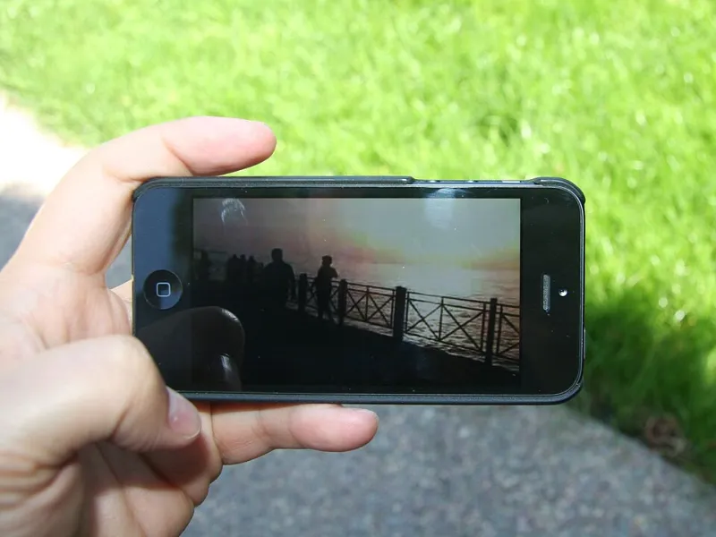
Vestibular symptoms don’t need flashing lights or 3D glasses. Large areas of moving background, camera moves that imply travel, zooming while scrolling, and mismatches between what the eye sees and what the body feels can all do it. On a phone, the effect is worse because the screen fills more of the visual field and the device itself is moving. A subtle parallax layer that looks classy on a studio monitor can feel like a small boat on a rough crossing in the hand.
The mistake is to treat this as a binary: full-motion site or dull static page. In practice, the most effective comfort-first work is a set of graded decisions. What moves, how far, how fast, and whether the user can turn it off.
The three usual suspects
Parallax
Parallax is the biggest offender because it creates a false sense of depth and travel. It’s also easy to overdo: multiple layers moving at different speeds, hero images that drift several hundred pixels, and scroll-linked backgrounds that never quite settle. A comfort-first approach keeps displacement modest, limits it to one plane, and avoids combining it with zoom. On mobile, many teams now drop background parallax entirely and use a single, slower foreground reveal instead.
Zoom and push-ins
Slow push-ins are a staple of brand films and product pages. In a video, a 10-second push can be cinematic; on a web page, the same move tied to scroll can feel relentless. The fix is not to ban zoom but to shorten it, anchor it to a clear focal point, and give the eye somewhere still to land. If the whole frame is moving, the viewer has no reference point. Keep a stable element — a logo, a headline, a fixed colour block — and the motion reads as intentional rather than queasy.
Frame rate and judder
Frame rate is where motion design gets religious. Cinema’s 24fps cadence feels filmic; UI motion at 60fps or 120fps feels responsive. Neither is inherently comfort-first. Low frame rates with fast movement produce judder, which can be worse than a higher frame rate with smooth easing. The practical rule: match the cadence to the content, avoid strobing and rapid cuts, and test on the devices people actually use. A 120Hz phone and a five-year-old office monitor are different planets.
What a motion-safety review looks like
Some UK studios are now running a formal ‘motion-safety’ pass alongside accessibility and brand QA. The shape varies, but the good ones share three traits.
First, they review the reduced-motion version as a first-class deliverable, not a stripped-back afterthought. That means a designed static state, a short cross-fade alternative, and a clear toggle where motion is central to the experience.
Second, they test with people, not just heuristics. One Manchester-based brand studio describes a 20-minute session with two or three motion-sensitive reviewers, asking them to scroll the build on a phone while describing what they feel. The feedback is brutally practical: ‘the hero made me put the phone down’, ‘the product zoom was fine until the text moved too’. That kind of note doesn’t come from a checklist.
Third, they log motion decisions like any other design token. Displacement caps, duration ranges, easing curves and ‘no simultaneous pan and zoom’ rules go into the design system. When a new campaign lands, the team isn’t renegotiating from scratch.
Comfort-first doesn’t mean quiet
None of this requires brands to go beige. Some of the strongest comfort-first work leans harder on graphic contrast, typography, colour and sound design. A sharp type reveal can carry more punch than a full-screen camera move. A colour wash that shifts slowly behind a static headline can feel premium without pretending the viewer is on a dolly. The trick is to decide where the energy lives: if everything moves, nothing lands.
Studios are also getting better at ‘motion budgets’. Instead of sprinkling animation across every section, they pick two or three moments and give them room. That’s better for attention, better for performance, and better for the inner ear.
The brief question
The next time a brief asks for ‘high-impact motion’, add a second question: impact on whom, and in what state? Someone might be watching on a crowded Northern line train, recovering from a migraine, or simply trying to read a caption in a hurry. Designing for that person doesn’t dilute the brand. It makes the brand feel considerate — which, in a crowded UK market, is its own kind of impact.