When the Screen Pushes Back: Designing Motion for the UK’s Forced-Perspective Sites
The screen is not a canvas. It is a site.
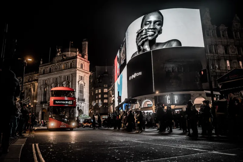
Anamorphic out-of-home has moved past the stage where the technology alone is the story. London’s Outernet and Piccadilly Lights have become familiar stops on the UK brand circuit, and newer installations in Manchester and Birmingham are giving planners more reasons to think beyond the capital. The pitch is seductive: a screen that appears to punch through the wall, a character that leans into the street, a product that seems to sit in the air above the crowd.
But the biggest mistake is still common. Teams treat the format as a flat advert with a 3D pop at the end. It is not. An anamorphic site has a viewing cone, a safe zone, a playback schedule and a public that is mostly walking somewhere else. Design for those realities before you open the software.
Start with the cone, not the camera
Every forced-perspective site has a sweet spot. The illusion is built for a particular relationship between screen, street and viewer. Ask the publisher for the viewing angles, the recommended approach and the point where the effect is meant to read best. Then decide what happens outside that zone.
For Piccadilly Lights, much of the audience is across a road and looking up at an angle. At a rail concourse or a retail atrium, people arrive from multiple directions and at different speeds. The primary read should work from the central approach; the secondary read should still make sense when someone catches it obliquely. If the whole idea collapses at 30 degrees, that may be acceptable, but the spot still needs to work as motion, colour and brand signal from the edges. Do not hide the logo inside the illusion.
Safe zones are not polite suggestions
Anamorphic screens often have content areas that look more generous than they are. Critical action can disappear into a bezel, a structural frame or a publisher’s overlay. Get the current spec sheet and build to it. Keep type, faces and key product details inside the safe area, and check how the site handles different crops and aspect ratios.
This is especially important when the same campaign runs across several UK sites. A composition that feels perfect at Outernet may feel cramped in a Birmingham transport hub. Design a master layout with clear rules for what can move, what can crop and what must stay put. The alternative is a last-minute scramble that turns a carefully built illusion into a flat pack.
Loop like a billboard, not a film
Most sites run short loops, and dwell time is not a cinema screening. A 60-second art film may get one showing in a window that only gives you a few seconds of attention. Build loops that are short, clear and repeatable. Ten to twenty seconds is often enough to set up a spatial idea, deliver the payoff and reset.
The first two seconds matter more than the last two. If the viewer misses the setup, the depth gag means nothing. Use a strong silhouette, a clean entrance and a readable brand cue early. Then give the loop a proper reset: no awkward freeze, no lingering frame that makes the next play look like a mistake. Repeat viewing should feel like a reward, not a glitch.
Brightness and British daylight
UK daylight is not a Hollywood grade. Overcast skies can flatten contrast, and a screen that looks rich in a dark studio can turn to mush in grey November light. Black is rarely truly black on an LED wall in public, so do not rely on subtle shadow detail to carry the idea. Build with contrast, shape and strong colour separation.
Test the spot on a phone at half brightness, outdoors, from a distance. If the product disappears into the background, simplify. If the type needs a second look, make it bigger. Brightness is not just a technical setting; it is a design decision about hierarchy.
Legibility at distance
Anamorphic work is often viewed from 20, 40 or more metres away, and usually while moving. That rules out paragraphs, thin weights and fussy detail. Keep copy to a short line. Use large type with generous spacing. Give the eye one message, not three.
Audio is not your friend here. Most public screens are muted or drowned out by traffic. If the idea only works with a soundtrack, it is not an out-of-home idea yet. The visual has to carry the story, with sound as a bonus rather than a crutch.
When depth earns its keep
This is the opinionated bit. Anamorphic only earns its budget when the idea actually needs depth. That means depth is doing narrative work: showing scale, explaining a spatial relationship, making a product feel physically present, or turning a building into part of the story. A train arriving, a shoe stepping out of the frame, a box opening into the street — these can work because the third dimension is the point.
If the only idea is a thing poking out of a screen, it is a stunt. Stunts date quickly, cost more than a flat spot and rarely survive a budget review. Anamorphic production adds bespoke modelling, perspective matching, site-specific testing and multiple render passes. If those costs are not in the idea from the start, the idea is not ready.
The better question is not “can we make it 3D?” It is “does this story need the screen to push back?” When the answer is yes, the format is genuinely powerful. When it is no, a sharp flat spot will often travel further and cost less.
A pre-pitch checklist
Before the pitch deck goes out, get the site spec, the viewing cone, the safe zone, the loop length, the brightness range and the audio capability. Build a flat fallback cut. Test the key frames at distance and on a phone. Decide what the oblique read looks like. And ask whether the depth is essential or decorative.
That last question is the one that separates a memorable anamorphic spot from an expensive novelty. The UK’s best forced-perspective work will not be the busiest. It will be the work that makes the street feel like part of the frame — and knows exactly why.