Words First, Motion Second: Choreographing Around Burned-In Captions
You spend three weeks on a 30-second brand film. The grade is lovely. The type is sharp. The product turns on a sixpence. Then the open caption lands across the lower third and suddenly your hero shot is wearing a black box. We have all been there. The caption was treated as a delivery requirement, not a design element, and the motion paid for it.
That is changing. As UK streaming platforms, social feeds and retail media screens lean harder on open captions — burned in, always on, no toggle — motion designers are discovering that subtitles are not a layer you add at the end. They are a compositional constraint. And like any good constraint, they can make the work sharper.
The caption is a cast member, not a sticker
Open captions are now routine on TikTok and Instagram Reels, common on YouTube Shorts, and increasingly expected across broadcaster catch-up services. Ofcom's accessibility expectations and the BBC's subtitle guidelines have long set a UK baseline: readable type, sensible line breaks, enough dwell time. But the practical fallout lands on the motion timeline. If a caption needs to be on screen for two and a half seconds to be read comfortably, that is two and a half seconds where your composition has to accommodate a block of text.
The first shift is mental. Stop thinking of the caption as a post house problem. Put it in the brief. Put it in the animatic. Put it in the frame before you choose the camera move. A caption that arrives late in the process will always look bolted on, because it is.
Reading speed is a timing curve
Caption guidelines commonly land around 160 to 180 words per minute for adult audiences, with two lines of text as a sensible maximum. Those numbers are not arbitrary. They describe a reading rhythm — and rhythm is your business. If your logo sting, product reveal and end card all fire inside the same four-second window as a fifteen-word sentence, something has to give.
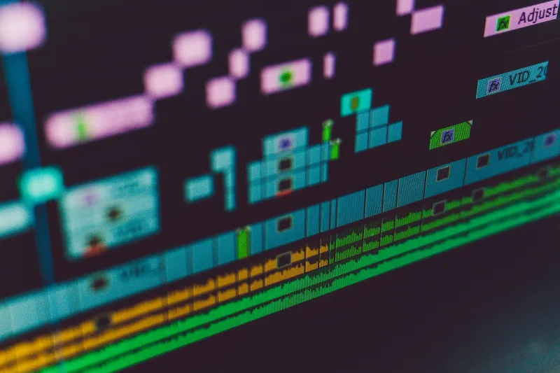
A useful habit: map caption cues before you animate a single keyframe. Treat each cue in and cue out as a beat. Then ask where the motion can live. Often the answer is in the upper two-thirds of the frame, or in the gaps between cues. The caption becomes percussion. You start designing around it rather than apologising for it.
Build a quiet zone, not just a safe area
A subtitle safe area — usually the lower third, adjusted for platform — is necessary but not sufficient. Text also needs contrast, and contrast is fragile when the background is moving. A gradient that looks lush in the grade can turn a caption into a grey smear. A high-frequency texture behind type is a readability tax.
So design a quiet band. Pick a horizontal strip where nothing moves fast, nothing flickers, and nothing shifts from dark to light underneath the words. That band becomes part of the composition. You can still have energy above it. You can still have a product moving through frame. You just stop pretending the caption zone is free real estate.
Choreograph the hand-off
Good motion anticipates. Bad motion collides. If a caption is due at 00:06, clear the zone by 00:05.6. Use a vertical exit, a wipe, a hold — anything that gives the eye a moment to settle before the words land. The same applies on the way out: do not launch a whip pan through the caption box the instant the line disappears.
This is especially important in 9:16. On vertical formats, captions often sit lower and closer to the action. A move that works in 16:9 can crowd the text in a Reel. Design both crops with the caption in mind, or design one and accept that the other will need a separate pass.
Test at the worst frame, on the worst screen
Scrub the timeline with captions on. Then scrub it again at 50% brightness on a phone in a bright room. Then imagine it on a retail screen above a till with daylight bouncing off the glass. UK supermarket and high-street screens are not cinema conditions. They are glare and bustle.
Look for caption collisions: descenders against a bright edge, thin weights disappearing into a mid-tone, a moving logo crossing the text baseline. These are the frames that make a polished film feel unfinished.
What you gain
The strange upside is that caption-aware motion often moves better. You stop over-animating the lower third. You build clearer holds. You use negative space with intent. The caption stops being the thing that ruined the frame and becomes the thing that gives the frame a pulse. Words first, motion second — and the whole cut lands cleaner for it.