Do Not Vectorise the History: Animating Britain's Antique Logos Without Sanding Off the Age
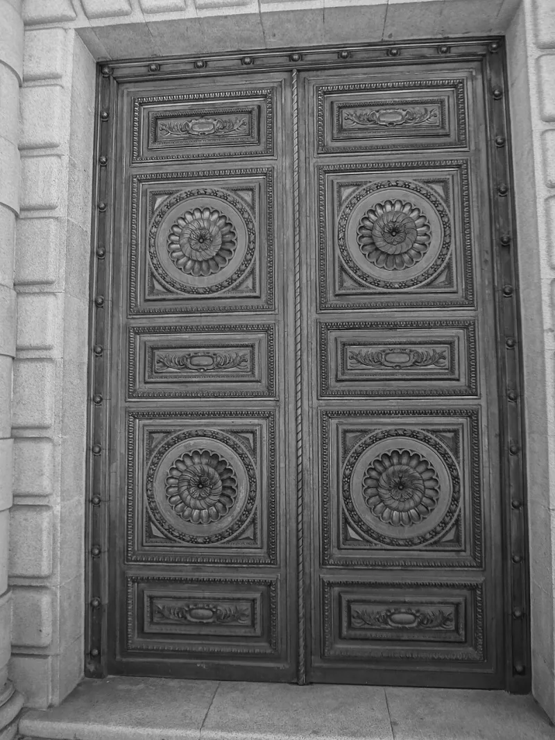
Photo: David Adam Kess, CC BY-SA 4.0, via Wikimedia Commons
Most UK brands with a mark older than about sixty years are sitting on a small archive they have never fully read. The logo exists as a vector in a brand portal, a JPEG on a legacy web page, and a box of packaging in a storage unit in Wakefield. Animating that mark well begins with noticing that those three things are not the same object.
The file in the portal is probably a redraw
Asset archaeology comes first. Before anything eases, you need to know what you are actually animating. Ask for the oldest physical material the brand still holds: enamel signs, brass plaques, delivery van liveries, letterheads, employee badges, bottling labels, tickets, stationery. Company archives, the V&A's design collections, the Postal Museum, local record offices and county archives all hold material that marketing teams have often forgotten they own. Scan at 1200dpi minimum, and scan the object rather than a print of a scan. The ink squeeze, the plate wear and the slight misregistration are evidence, not noise.
Expect a fight. The vector in the brand portal is almost certainly a redraw from the 1990s or 2000s, and redraws sand off exactly the things that make a mark feel old. A crossbar that was never quite level has been levelled. A curve that was cut by hand, and is therefore faintly flat on one side, has been made mathematically round. A serif that came off a wood block has been swapped for a digital Garamond. None of this is anyone's fault, and all of it matters.
Catalogue the quirks before you fix them
Make a list of every irregularity in the original and mark each one as load-bearing or incidental. Load-bearing quirks are the ones a person would recognise from across a street: the fat-to-thin rhythm of a Victorian grocer's monogram, the awkward gap between two letters in a 1930s railway roundel, the way an ampersand leans. Incidental quirks are damage: a chipped enamel edge, a registration error, a photocopier artefact.
Build the animated version from the load-bearing set. Rebuild the outlines from the physical specimen rather than auto-tracing a low-res JPEG, and keep the optical corrections the original engraver made. That means the slightly heavier horizontals, the ink-spread allowance at junctions, the trapping where two colours meet. These are not flaws to be cleaned. They are what a print-maker had to do to make a mark survive a press, and on screen they read as age.
Easing should belong to the era of the mark, not the campaign
This is where most heritage work goes wrong. A 1904 mark given an elastic overshoot and a two-frame squash looks like a 2026 app icon wearing a costume. Match the motion language to the period of the mark's making, not to current fashion.
For pre-war marks, think mechanism: constant velocity, hard stops, the movement of a shop sign on a bracket or a clock hand. Draw-on reveals should follow the order the original engraver would have cut, outlines before fills, stems before terminals. For mid-century marks, think broadcast and print registration: stepped animation at 12fps, short holds, a settle rather than a bounce. For anything referencing an industrial process, allow the motion to be a little stiff. Stiffness reads as authentic.
The same logic governs what you must not do. Do not rotate a mark that was printed flat. Do not let a serif flex. Do not add secondary motion to a mark whose entire character is stillness. And do not animate faster than the mark can be read. A heritage logo is often denser than a modern one, with more strokes and tighter counters, so it needs more time on screen, not less.
Write a motion constitution, not a motion deck
Once you have a look, put it in writing. A short motion constitution, three or four pages rather than a forty-slide deck, does more to protect a heritage mark than any amount of taste. Set hard limits: maximum rotation, minimum on-screen duration, permitted easing families, reveal order, colour sequence, and a clear statement of which quirks are protected and may not be redrawn by anyone downstream.
Then give it to the people who will actually break it. The social team. The regional media buyers. The agency producing the DOOH loop. The in-house designer making an After Effects template on a Tuesday afternoon. A heritage mark survives on the strength of its constraints, and the constraints only work if they are written down and just slightly annoying.
Test it where Britain actually watches
Easing that looks refined on a calibrated monitor can fall apart on a wet digital six-sheet on a high street, a phone at 40 percent brightness on the Northern line, or a stadium screen viewed from forty metres. Export the compressed versions, not the master. Check the thin strokes at small sizes and the hairline gaps between letters. Check the mark against the worst background it will meet: a muddy photograph, a sponsor's red, a busy crowd.
The handshake, not the takeover
The best heritage motion does not modernise the mark. It introduces it. The logo arrives, holds, and gets out of the way, and the audience reads continuity rather than a launch. That is the handshake: brief, deliberate, and confident enough not to overstay.
At NovaGFX we treat these marks as artefacts with a pulse, not vectors to be optimised. That usually means fewer keyframes than the client expects, a longer archive phase than the schedule allows, and a final result that looks almost still. Almost still is the point.