The High Street Is a Hostile Gallery: Motion That Survives British Weather
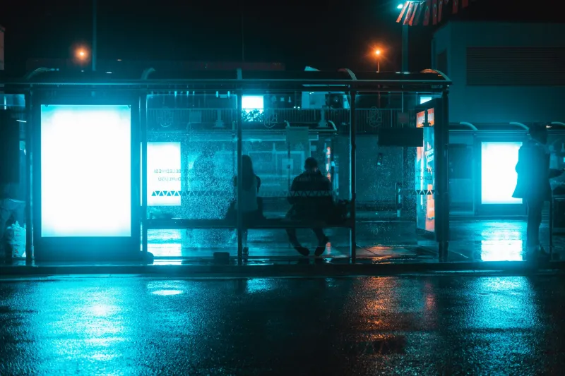
There is a particular kind of disappointment that comes from seeing a campaign you signed off on a bright studio monitor turn into a pale smear on a wet bus shelter in Leeds. The animation is the same. The file is the same. The screen is not. Outdoor motion in the UK is a design problem disguised as a media buy, and the weather is part of the brief whether the client wants to hear it or not.
The studio monitor is a liar
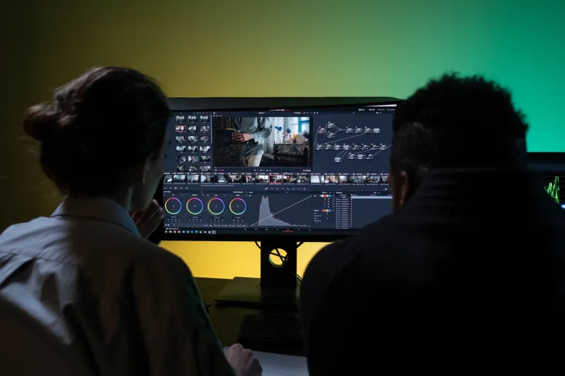
Most motion work is approved in conditions that do not exist outdoors. We review on calibrated displays in rooms with controlled light, at full brightness, usually with a cup of tea and no rain running down the glass. A roadside screen might be operating at half its peak luminance to keep within local authority rules. It might be angled towards a low November sun. It might be behind acrylic that has collected a day of road spray. The gap between those two viewing conditions is where good-looking work goes to die.
The fix is not complicated, but it is uncomfortable. Start by watching the edit at 50 percent brightness on a cheap laptop, then in grayscale, then through a sheet of clear plastic misted with water. If the idea still reads, you have something. If it only works at full brightness with the sound on, you have a showreel piece, not an outdoor campaign.
Contrast is a weather report
In flat winter light, contrast does more work than colour. A dark background that feels premium in the studio can collapse into a grey rectangle on a bright high street. A white background can bloom and swallow thin type. Mid-tone backgrounds with strong, simple shapes tend to survive because they give the eye something solid to hold onto when the screen is competing with wet pavements, shop windows and headlights.
Test the key frames in grayscale before you test them in colour. If the logo, the offer and the call to action all sit at the same tonal value, the ad will read as texture rather than message. Hairline type, fine gradients and subtle drop shadows are the first casualties. So are small product shots. A bottle of perfume might look lovely on a 27-inch display; at 30 metres through rain, it is a dark smudge with a nice lid.
Colour under a grey sky
UK winter light is not neutral. It is flat, cool and often slightly green, and it makes certain brand colours behave badly. Deep blues can go muddy. Saturated reds can vibrate against grey architecture. Pale pastels can disappear entirely. That does not mean abandoning the brand palette. It means building an outdoor variant with more separation between foreground and background, and testing hue shifts on the actual screen type where possible.
Warm accents often cut through wet, cool scenes because they contrast with the environment rather than trying to outshout it. But be careful with reds and greens at roadside sites, where colour vision deficiency and quick glances are both factors. Do not rely on hue alone to carry meaning. Use shape, position and motion to reinforce the message. A red circle and a green circle are not a strategy; a red circle with a clear arrow and a green circle with a tick are.
Wet glass is a second screen
Rain turns acrylic into a mirror. You are no longer designing for one surface; you are designing for the screen plus whatever is reflected in it. Headlights, indicator lights, shop signs and the orange glow of a takeaway can all land on top of your animation. High-frequency detail — dense text, busy patterns, rapid cuts — gets shredded by that interference. Simple silhouettes and generous negative space give the viewer a chance to parse the message between reflections.
The practical test is crude and effective. Print a key frame, put it behind a wet plastic sleeve, and look at it from the other side of the room. If the main shape still reads, it will probably survive a bus shelter. If you have to squint, the high street will not be kind.
Low sun and early dusk
November brings two lighting conditions that catch out outdoor motion: low sun and early dusk. A screen facing the sun can be washed out for part of the day, especially when the sun is low enough to sit behind the panel. White flashes and bright transitions are worst here because they make the whole surface glare. Dayparting is not a luxury. A brightness schedule that drops the white levels in the morning and late afternoon can save a campaign that would otherwise look like a camera flash in a puddle.
Early dusk is the friendlier condition, but it changes the reading of the work. A sequence that feels punchy at noon can feel frantic at 4.30pm when the screen is one of the brightest things on the street. Slow the transitions. Hold the end frame longer. Let the eye settle. The same file can feel like two different pieces of work depending on the hour, and that is a design decision, not an accident.
Speed, frame rate and the roadside glance
Outdoor dwell time is short, but it is not uniform. A pedestrian at a bus stop might give you five seconds. A driver on a dual carriageway might give you two, and only if the traffic is heavy. Design for the shorter window first. One idea per frame, one clear hierarchy, one obvious next step.
Fast cuts and whip pans are risky on LED because the panel can strobe or smear depending on refresh rate and camera exposure. If a sequence looks fine in the edit but feels jittery at distance, simplify the movement rather than adding more frames. Slower eases and longer holds are not a compromise; they are how the work survives the viewing conditions. Test the animation from 10 metres and 30 metres, not just at desk distance. The version that feels too slow in the studio is often the one that reads on the street.
A test routine worth building into the schedule
Before any outdoor master is signed off, run it through a short, repeatable set of checks. View at 50 percent brightness. View in grayscale. View through wet acrylic. View from across a room. Check the first and last frames for glare. Check the colour against the media owner's screen spec. Check the dayparting plan for sun-facing sites. Check the local authority brightness limits if the site is near a road.
None of this replaces a proper site visit, but it catches the obvious failures before they become someone else's problem. It also gives the client a shared language for the trade-offs. Outdoor is not a bigger phone. It is a moving target with weather, reflections and a very short window of attention.
Brief the weather in
The best outdoor motion work in the UK does not pretend the weather away. It designs for the grey light, the wet glass and the early dusk, then makes those constraints look intentional. That is the difference between a campaign that looks punchy in a studio and one that still has a pulse on a wet November high street. NovaGFX would rather find that out in the test room than on the side of a road in Birmingham.