The Last Two Seconds Are a Stress Test: End Cards That Survive UK Streaming Compression
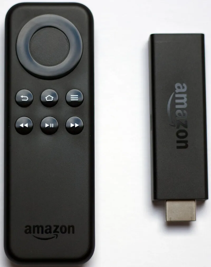
Photo: www.hdmi-experte.com, CC BY 4.0, via Wikimedia Commons
The end card is the bit everyone signs off and nobody fights for. It arrives after the hero shot, after the punchline, after the music has done its work. Then it asks for two seconds of attention while carrying the logo, the legal line, the URL and the call to action. On a calibrated monitor in a Soho suite, it looks immaculate. On a UK streaming ad tier, through a smart-TV app and a domestic broadband connection, it can look like a ransom note smeared in Vaseline.
Call it the end-card tax. The final two seconds are often encoded at the same time as the rest of the spot but judged by a much harsher standard. Viewers need to read them. Brands need them to be recognisable. Legal needs them to be present. And the codec needs them to be simple. Those four demands do not always get along.
The codec does not care about your brand guidelines
Streaming platforms do not serve your master file. They transcode it into a ladder of bitrates and resolutions, then hand it to a device that may be a 4K OLED in a Bristol living room or a five-year-old smart TV in a rented flat. Many of those devices are working with limited processing power and a connection that is doing its best. The result is blocking, ringing around high-contrast edges, and chroma subsampling that turns saturated colours into bleeding patches.
That is why thin logo weights, hairline rules and gradients on dark backgrounds are risky. A serif with delicate terminals can lose its shape. A red logo on black can bleed into the background. A legal line set in light grey can turn into a texture rather than a sentence. The fix is not to make everything ugly. It is to design for the transcode from the start: solid fills, generous contrast, fewer fine details, and a clear hierarchy that survives when the image gets soft.
Safe areas are not a suggestion
Broadcast safe areas used to be the reference point. Streaming is messier. Smart-TV apps can crop, overlay progress bars, or push the picture around in ways that are not in your delivery spec. Some ad tiers add their own furniture. Some devices overscan. A logo parked near the edge can lose a letter. A legal line tucked into the bottom right can sit under an app prompt.
For end cards, keep the logo and the legal line inside a central 90 per cent safe area. Keep the call to action and any QR code inside something closer to 85 per cent. Do not put anything critical in the bottom right corner. Give the end card more margin than you think it needs. Empty space is not wasted here; it is insurance.
Type that survives the ladder
The legal line is usually the first casualty. It is small, it is grey, and it is often the least-loved element in the frame. But if it cannot be read, it may as well not be there. Set it at a size you can read on a phone at arm's length. Use a heavier weight than you would in print. Avoid condensed faces and long lines. Break the copy into short, clear rows. If the legal text is genuinely long, give it its own beat rather than cramming it into the same two seconds as everything else.
URLs need the same treatment. Drop the https:// and the trailing slash. Keep the path short. One call to action is better than three. If you are using a QR code, give it a quiet zone, high contrast and enough size to scan from a sofa. Test it at 720p, not just on the master. A QR code that works on a desktop monitor and fails on a TV is not a call to action; it is a decorative square.
Motion that helps the encoder
End cards often get animated because static frames feel lazy in a pitch. But fussy motion in the final two seconds is expensive for the codec. Particles, light sweeps and slow one-pixel drifts can judder when the frame rate changes between 25fps, 24fps and 50fps. A logo that floats gently in the grade can stutter on a device that is dropping frames.
The safer approach is to let the end card settle early. Bring the elements on with a clean cut or a short, high-contrast move, then hold. Give the logo at least a second and a half of stillness. Do not animate the legal line. Do not fade to black at the end; it gives the encoder another soft transition to smear. If you need motion, make it bold and brief rather than subtle and continuous.
Test on the telly, not just the timeline
A common mistake is to approve the end card from a ProRes master on a reference monitor. That tells you the design works in ideal conditions. It does not tell you what happens after the platform has chewed it up. Watch the spot through the actual apps your audience uses: ITVX, Channel 4, My5, Sky, Freeview Play, whichever ad tiers are in the plan. Watch it on a cheap smart TV and a good one. Watch it at 720p. Watch it with the sound off. Watch it on a phone.
Ask the media agency for the platform specs early. Deliver a high-quality mezzanine rather than a compressed file. Keep a clean end-card version without platform furniture so you can adapt it later. And check the HDR-to-SDR journey if the spot is being graded in HDR; an end card that looks rich in HDR can look dim and muddy on an SDR set.
The 2026 end-card checklist
- Build the end card at 1080p first and review it at 720p and 480p. If it fails at 720p, it will fail on a lot of UK tellies.
- Keep the logo and legal line inside 90 per cent safe area; keep the CTA inside 85 per cent.
- Use solid fills, strong contrast and fewer fine details. Avoid thin type, hairlines and gradients on dark backgrounds.
- Set the legal line in a heavier weight and break it into short rows. Do not let it become grey fog.
- Shorten the URL, choose one CTA, and test any QR code on an actual TV.
- Let the end card settle early and hold for at least 1.5 seconds. Avoid fades to black and fussy motion.
- Check the frame rate on 24fps, 25fps and 50fps outputs. Holds and cuts travel better than slow drifts.
- Watch the final through the real UK streaming apps, on real devices, before sign-off.
The end card is the last handshake between the brand and the viewer. It deserves more than the leftover two seconds. Design it for the transcode, give it room to breathe, and it will still look like the brand when the bitrate drops. Ignore the end-card tax, and the final frame will be the only part of the spot that nobody remembers.