Aspect-Ratio Debt: Why the Final Cut Is Where Budgets Go to Die
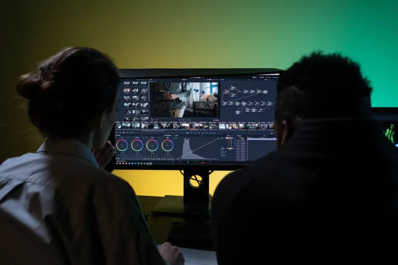
There is a line item that rarely appears in the original quote. It hides behind the word 'adaptations'. One hero film is approved in 16:9, everyone leaves the review with a warm feeling, and then the schedule quietly adds 9:16, 1:1, 4:5 and whatever the in-app placement demands this quarter. The resize itself is not the problem. The problem is that every new frame asks the same question again: where is the story now?
That question has a cost. It shows up as overtime, re-renders, legal re-approvals, late subtitle fixes and the particular misery of discovering that the product reveal sits just outside the vertical crop. Call it aspect-ratio debt. It compounds quietly, and the final cut is usually where it lands.
The resize is cheap; the recomposition is not
A competent editor can turn a 16:9 master into a 9:16 file in minutes. That is not the job. The job is deciding whether the central gag still reads when the frame narrows, whether the end card has room for a legal super, whether the type is legible on a phone held at arm's length on a Northern line platform, and whether the brand's motion signature still looks deliberate rather than cropped by accident.
Each of those decisions reopens approval. Each approval pulls in a producer, a client, sometimes legal, often a creative director who thought they were finished with the project. The actual pixel work is a fraction of the bill. The rest is coordination, context-switching and the slow erosion of craft that happens when a team is asked to solve composition problems at the end of a schedule instead of the start.
Where the bill hides in a UK schedule
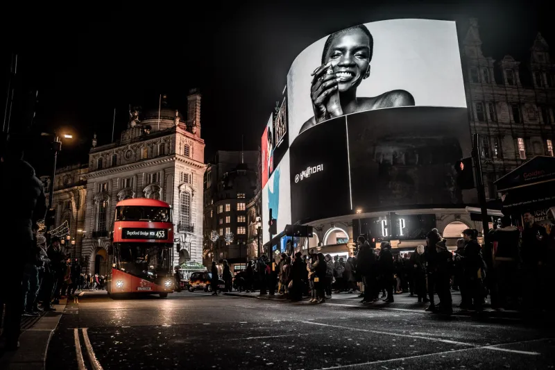
In the UK, the pressure often comes from retail media screens, station and roadside digital, in-app placements and the endless versions required by broadcaster and platform specs. A campaign that was sold as one film becomes a small family of films, each with its own safe areas, caption rules and duration limits. The 30-second hero becomes a six-second bumper. The six-second bumper becomes a silent loop. The silent loop needs a different end frame because the call to action cannot be heard.
None of this is exotic. It is the normal shape of motion work in 2026. What is still unusual is how often the adaptation plan is treated as a post-delivery admin task rather than a design constraint. The result is a team trying to protect a carefully built wide-frame composition while a producer asks whether the logo can move left by 40 pixels for the fourth time.
Rule one: design a core frame, not a hero frame
The most practical fix is to stop treating the widest frame as the real film. Build the master around a protected core: a central square or near-square area that carries the story, with type and secondary action placed in zones that can survive a vertical crop. This does not mean every frame must look like a social ad. It means the director and designer agree early on what cannot be lost.
In practice, that means testing the key frames in 9:16 and 1:1 at the animatic stage, not after the grade. It means deciding whether the camera move depends on horizontal travel, because that move will die in vertical. It means checking whether the product enters from the left edge of a widescreen frame, because that entrance will be invisible on a phone. A core frame is not a compromise; it is a contract between the film and its future versions.
Rule two: make type a system, not a sticker
Baked-in type is where a lot of reframe debt starts. A headline that looks elegant in 16:9 can become a three-line stack in 9:16, and a legal super that fits in a wide lower third can swallow half a vertical screen. The answer is not to shrink everything until it is unreadable. The answer is to design type as a system with defined sizes relative to frame height, approved line breaks and a hierarchy that can be rebuilt per ratio.
Keep text live where possible. Name the layers clearly. Supply the fonts, the licences and the fallback styles. If the type is being rebuilt by someone else at 11pm, the handover has already failed. A good type system lets a motion designer adapt a headline in minutes without asking whether the brand team will accept a new line break. That is worth more than another round of polish on the hero frame.
Rule three: choreograph for the crop
Some motion behaves badly when the frame changes shape. Long horizontal wipes, edge-dependent reveals and compositions that rely on negative space at the sides are all high-risk. Motion that scales, pushes in, reveals vertically or builds from the centre tends to survive. This is not a rule about style; it is a rule about where the audience is looking when the frame is narrower than the one you designed.
At the previs stage, ask a simple question: if this shot were cropped to 9:16, what would be left? If the answer is 'a product and a lot of empty space', the shot needs a second plan. If the answer is 'the back of someone's head', the shot needs a different composition. Building that check into the animatic is cheaper than discovering it in the online.
Rule four: handover is a deliverable
A flat MP4 is not a handover. It is a receipt. If a studio wants to avoid the reframe tax, the project file has to be part of the deliverable: organised layers, named nulls, expressions that still work, fonts, LUTs, render settings and a version matrix that says what has been approved in which ratio. The client may never open it, but the next studio or the in-house team will, and the cost of a chaotic handover always comes back to the original supplier in the end.
This is also a commercial argument. An adaptation-ready master is a product. It can be priced, specified and sold as part of the package. A studio that says 'we will design for the ratios you have told us about, and here is what happens when a new one appears' is easier to trust than one that absorbs every surprise and quietly cuts the craft to pay for it.
The last cut is expensive because it is the first time anyone looks
The final cut is not where budgets go to die because editors are slow. It is where budgets go to die because it is often the first moment the vertical version is judged as a piece of work rather than a technical output. By then, the composition is locked, the approvals are closed and the schedule has no room for a real solution.
The alternative is not complicated. Protect a core frame. Test the ugly ratios early. Treat type as a system. Choreograph for the crop. Hand over properly. None of these ideas are glamorous, but they stop a single hero film from becoming five separate rescue jobs. In a market where every screen is a channel and every channel has a different shape, the studios that design for the crop will spend less time paying the tax and more time making work that actually looks like it was meant for the screen it lands on.