The Movement Manual: Codifying Brand Motion Before the Campaign Drifts
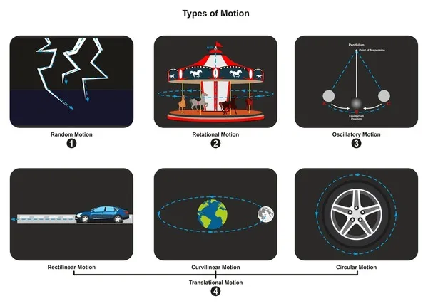
Photo: motion design storyboard frames with easing curve graph on studio desk, via www.shutterstock.com
There is a particular kind of brand drift that only shows up when you put everything side by side. The homepage hero glides in over 800 milliseconds. The retail media screen snaps in 200. The Instagram cutdown bounces like it has had three espressos. The app transition drifts somewhere in between, because nobody remembers which prototype was signed off. None of these things is necessarily wrong. Together, they are a brand with a limp.
Most UK brand teams have spent years tightening typography, colour and logo usage. Motion is often the last asset to get a proper rulebook, largely because it has historically been shipped by whoever had the file open. A campaign agency makes one set of choices. An in-house product team makes another. A regional production partner in Manchester or Glasgow, briefed three weeks before launch, makes a third. The result is motion drift: not chaotic, not catastrophic, just quietly inconsistent.
What a motion token actually is
A motion token is a named, reusable decision. Instead of telling a designer to make something feel snappy, you give them a value: duration-fast, 160ms; ease-brand-enter, cubic-bezier(0.2, 0.8, 0.2, 1). Instead of hoping everyone remembers the rule about reduced motion, you codify the fallback. Tokens can cover duration, easing curves, travel distance, opacity ranges, stagger intervals, transition patterns and the accessibility limits that sit around all of them.
This is not a new idea in product design. Design systems have used tokens for colour and spacing for years. Motion is simply harder to pin down because it happens over time and depends on context. A 400ms reveal that feels luxurious on a 65-inch retail screen can feel glacial on a phone. A springy overshoot that works for a consumer app can look unserious in a financial services interface.
That is why a useful motion grammar has two layers. The first is the core vocabulary: the curves, durations and rules that are genuinely brand-level. The second is the application layer: how those tokens behave on a DOOH screen, a checkout flow, a TikTok cutdown or a stadium ribbon board. The core stays stable. The application flexes.
Why drift happens long before the render
Motion inconsistency usually is not caused by careless designers. It is caused by handoffs. A brand team signs off a launch film. The social team cuts it down. The ecommerce team builds a landing page. The retail media team supplies a loop for a screen network. The app team ships an update. Each group makes locally sensible decisions with the assets they have, and nobody owns the connective tissue.
UK brand rosters make this worse. It is common to have a lead creative agency, a specialist motion partner, an in-house studio and a handful of regional production suppliers all touching the same brand in the same quarter. Without a shared reference, every new supplier reinterprets the movement from scratch. The result is more revision rounds, slower onboarding and a lot of quiet rework that never appears on a timeline.
A motion token library does not solve organisational complexity. It does give everyone a common language. A freelancer joining for a two-week social sprint can open the file and see the approved curves. A product designer can check whether a proposed transition is within the brand's duration range. A production partner can build a retail loop that feels related to the campaign film without copying it frame for frame.
The accessibility floor is not optional
Any UK motion grammar has to include accessibility limits, not as a footnote but as a hard constraint. Reduced-motion preferences, flashing thresholds, parallax limits and vestibular safety are not niche concerns. They are part of building for a public that includes people with migraines, vestibular disorders, epilepsy and attention differences.
This is where tokens earn their keep. If reduced-motion behaviour is written into the system, it stops being a conversation on every project. The token says: when reduced motion is requested, replace travel with a fade, cap duration, remove parallax and avoid autoplay loops that cannot be paused. That is a design decision made once and applied consistently, rather than a last-minute scramble after an accessibility review.
It also helps with regulation and procurement. Public sector and large enterprise briefs increasingly ask for evidence of accessible motion. Being able to point to a documented rule set is more convincing than promising that the team will be careful.
Build a grammar, not a cage
The fastest way to kill a motion system is to make it feel like a compliance document. Designers will ignore it, or worse, follow it so literally that everything looks the same. A good grammar gives people a confident starting point and clear room to move.
Start with an audit. Gather the motion already in the wild: campaign films, app transitions, social cutdowns, retail screen loops, presentation builds. Put them side by side. You will probably find three or four recurring curves and a wide spread of durations. Name what is already working. Retire what is not. Then define a small set of tokens — fast, base, slow, enter, exit, emphasis — and document where each applies.
Keep the naming human. Tokens called curve-07 and duration-14 will not survive a busy studio. Names like enter-soft, exit-quick and emphasis-pop do more work because they describe intent.
Tooling matters, but governance matters more
Tokens can live in Figma variables, CSS custom properties, After Effects expressions, Lottie metadata, Rive state machines or a plain PDF that everyone actually reads. The format is less important than the ownership. Someone has to maintain the library, review exceptions and update it when the brand evolves. Without that, the system becomes another dormant asset in a shared drive.
A lightweight governance model works better than a heavy one. Nominate a motion lead. Review new patterns quarterly. Keep a changelog. Make it easy for external partners to access the latest version. Treat exceptions as useful signals rather than failures; if three teams independently break the same rule, the rule probably needs revising.
What consistency actually buys you
A movement grammar will not make every campaign feel identical, and it should not. It buys something more useful: recognition. When a viewer sees a brand transition on a phone, a retail screen and a connected TV ad in the same week, the movement should feel like it belongs to the same family. Not the same sentence, but the same language.
It also buys speed. Fewer decisions from scratch. Faster onboarding for regional partners. Cleaner handoffs between campaign and product. Less time spent in review arguing about whether something feels too slow, because there is a shared reference for what slow means.
Motion is now spread across more surfaces than most brand guidelines were designed to handle. A movement grammar is how UK teams keep that sprawl from turning into drift. The work is not glamorous. It is naming curves, writing rules and agreeing on limits. But it is the difference between a brand that moves and a brand that merely fidgets.