Six Seconds at the Till: Motion Design Rules for Britain's Retail Media Screens
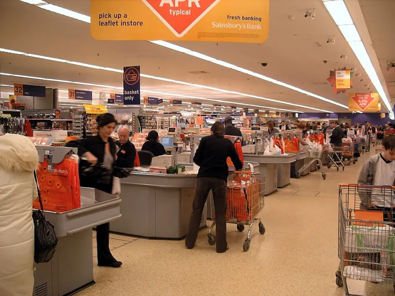
Photo: Velela at English Wikipedia, Public domain, via Wikimedia Commons
There's a particular kind of screen that has quietly multiplied across the UK. It hangs above the self-checkout, sits at eye level on the shelf edge, or glows at you from a forecourt pump while you wrestle with a nozzle. It is not a TV, not quite a billboard, and definitely not a website. It is retail media, and it is now one of the fastest-growing places a motion designer's work can end up.
The numbers tell one story. Tesco, Sainsbury's, Co-op, Boots and the major forecourt operators have all spent the past few years turning their physical estates into ad networks, and in 2026 the briefs are landing with studios that used to think of retail as a print job. The other story is craft. A checkout screen is a hostile environment for motion: bright lights, short glances, no audio, and an audience that is politely trying to pay and leave. Design for it badly and you get a smeary blur that nobody remembers. Design for it well and you get six seconds of genuine attention, several times a day, in front of millions of people.
The glance ladder: dwell time is shorter than the brief says
Retail media decks love a big dwell-time number. Be sceptical. The figure usually describes how long a shopper is in the queue, not how long they look at the screen. In a busy Tesco Express at 6pm, that glance might be two seconds. At a motorway services forecourt on a Sunday, it might stretch to eight or ten.
Treat those as a ladder rather than an average. Build your loop so the first second carries the brand, the next two carry the message, and anything after that is bonus. If the idea only lands at second five, it's a cinema ad in the wrong room. The best retail loops I've seen recently work like a poster that happens to move: a clear colour field, a strong type lockup, one piece of product photography, and a single motion beat that resolves.
Glare is the enemy, and white is its best friend
Most retail screens live under fluorescent strip lighting or, in the case of forecourts, direct sunlight. A design that looks crisp on your calibrated monitor will look like a milk spill in situ. The most common mistake is a white or pale background with fine dark text — the exact combination that washes out under reflected light.
Go the other way. Dark or saturated backgrounds, high-contrast type, and a palette that survives a bit of bloom. If the brand guidelines insist on white, use it as a panel inside a coloured frame rather than the whole canvas. And always, always test on the actual hardware. A £200 Android media player in a plastic enclosure behind perspex does not render gradients the way your laptop does. Banding, crushed blacks and a slightly green cast are all part of the medium.
Silent by default: motion that works with the sound off
Almost every retail media screen in the UK runs muted. Some have audio capability, but in a checkout aisle, nobody wants it. That means your motion has to do the work that a voiceover would normally do: establish the brand, name the product, and land the offer without a single word being spoken aloud.
This is where kinetic typography earns its keep—but only if it's legible. Text that animates in with a flourish and then holds for 1.5 seconds is fine. Text that slides, bounces and settles over four seconds is not. The eye needs a still moment to read. If your loop has no frame where the key message is completely static, you've written a headline nobody can finish.
Crowded frames: brand safety in a visual scrum
The checkout aisle is one of the busiest visual environments in the country. Packaging, shelf talkers, floor vinyls, other screens. Your motion is not competing with a blank wall; it's competing with a wall of messages. So resist the urge to fill the frame.
A few rules that hold up. Keep a generous safe margin — at least 10% on every edge — because screen bezels and mounting brackets eat into the visible area. Avoid reds and greens that clash with supermarket own-brand livery. And be careful with motion that mimics a flashing promotion, because in a retail context that reads as a price cut even when it isn't. If you're advertising a premium product, don't borrow the visual grammar of a clearance sale.
There's a brand safety angle too. A loop that runs next to a competitor's shelf edge needs to be self-contained: no ambiguous claims, no busy disclaimers that can't be read in time. Legal teams are getting more involved in retail media creative, and they're right to. If the small print can't be read at a glance, it shouldn't be in the loop.
The loop is a system, not a film
A 15-second hero film cut down to six seconds rarely works. Retail loops are better built from modular parts: a brand bumper, a product beat, an offer card, a call to action. That way the same assets can be re-cut for a 10-second forecourt slot and a 30-second pharmacy queue without starting from scratch.
Think in beats rather than scenes. A two-second brand flash, a three-second product hold, a one-second transition. Keep transitions short and directional — a wipe or a cut reads better at a glance than a slow dissolve. And build in a clean loop point, because these screens run for hours and a visible jump every cycle starts to feel like a fault.
Measuring recall without fooling yourself
Retail media networks will happily sell you a recall study. Treat the numbers with the same scepticism you'd apply to any other media metric. The interesting question isn't whether someone remembered seeing a screen; it's whether the motion did any work that a static poster couldn't. In practice, that means testing two versions: one still, one moving, and comparing prompted awareness or QR scans over a few weeks.
QR codes are a useful proxy, but only if they're on screen long enough to scan — a minimum of three seconds, and ideally with a static hold. Don't bury them in a corner. If the call to action is the point, give it the frame.
A short checklist for the next retail brief
- Design for the shortest plausible glance, not the average dwell time.
- Build contrast for glare; avoid white fields and fine type.
- Assume muted audio and write for the eye.
- Hold key text still for at least 1.5 seconds.
- Test on the actual player and the actual screen.
- Keep margins wide and the loop point clean.
- Make the call to action static and scannable.
The checkout aisle is not a cinema. It's a place where people are half-looking, half-listening to a self-checkout robot, and fully intending to be somewhere else. Motion design that respects that — short, clear, well-lit and quiet — will outperform the showy stuff every time. And in 2026, with retail media budgets still climbing, that's a brief worth getting good at.