Glare, Grit and Twenty Minutes: Designing Motion for the Charging Bay
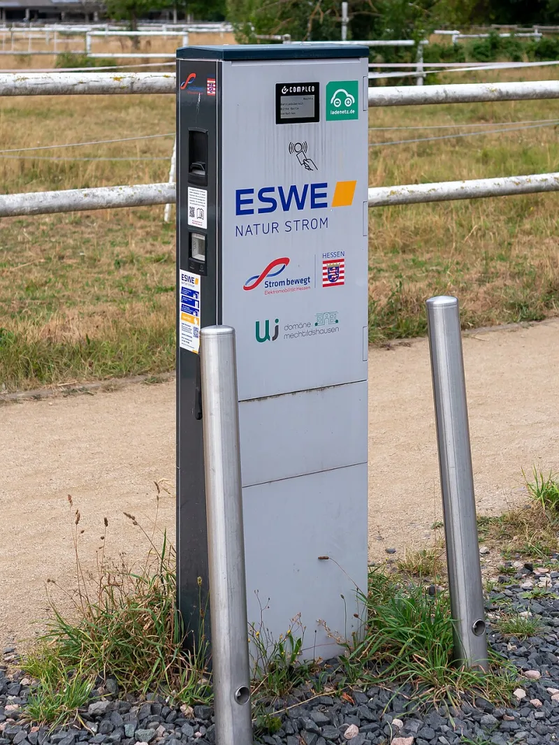
Photo: Matti Blume, CC BY-SA 4.0, via Wikimedia Commons
The forecourt stopped being a checkout
For most of the last thirty years, forecourt design assumed you would be gone in under two minutes. Pump, pay, pull away. Screens were built for the length of a card transaction and the attention span of someone already reaching for the door handle.
Then the plug arrived and the maths fell apart. A rapid charge on a motorway service area is rarely under fifteen minutes, and the working figure most UK operators quote now sits somewhere in the low twenties — longer if the queue for a working connector ate into your afternoon. Drivers aren't leaving. They're sitting in the car with the heater on, or standing under the canopy in a coat, watching a percentage climb with all the ceremony of a kettle boiling.
That's a captive audience, but a strange one. Nobody is there to be entertained. They're there because the car is, and the screen in front of them has roughly sixteen minutes of secondary attention to fill without getting in the way. Treat that as a broadcast slot and it'll feel like a nuisance. Treat it as signage with ambition and it can do real work.
The viewing geometry is genuinely hostile
Start with the physical facts, because they're harsher than anything a shopping centre screen will throw at you.
Most charging-hub displays sit two to three metres from a person standing at the connector, often in portrait, often bolted to the charger itself. That's closer than a retail media panel and further than a phone. It's an awkward middle distance where fine detail survives but small type doesn't.
Then add the weather. Low winter sun across a wet forecourt is about as brutal a lighting condition as British design has to solve — glare off the acrylic, streaking rain, condensation on the inside of the glass, salt spray from the M6 in February. A grade that looks punchy on a calibrated monitor in Shoreditch will turn to grey soup the moment it's behind a wet panel at 8am in Carlisle.
Test at roughly forty per cent of the contrast you'd normally accept. If the frame still reads, ship it.
Nobody is standing there to be impressed
This is the mindset shift that trips up studios pitching forecourt work for the first time. Charging-bay attention is peripheral, not frontal. A driver checks the screen, looks at the car, checks their phone, looks at the screen again. The loop is glanced at, not watched.
Which means the motion has to be built for re-entry rather than repetition. Every beat needs to be legible in two seconds from a cold start, because most of your audience will arrive mid-loop and leave before it ends. Coming back to a frame you've already seen half of is the normal experience, not the edge case.
Payment anxiety quietly runs the room
The transaction now lives on a phone in someone's hand — an app, a contactless tap, a roaming platform. That single fact should govern everything on the screen.
If the display looks interactive, you've created a second job for someone who is already doing one. Fake buttons, hover states, animated QR codes and 'tap to begin' language all generate the same small spike of uncertainty: am I meant to be doing something else? At a charger, uncertainty is expensive. It produces support calls, bad reviews and drivers who unplug early to go and find a human.
Keep the screen declarative. It tells you things; it does not ask you for anything. If the operator's app handles payments, the screen's only job is to remove ambiguity — which bay, which connector, how long, what next.
Safety signage outranks the brand, every time
Some screens sit beside, rather than inside, a live status panel showing charge rate, bay number and fault codes. Where that's the case, the motion has an unbreakable obligation: leave room, yield promptly, and never compete.
Practical version of that rule — reserve a clear band around any safety or status information, keep ambient motion out of it, and if the site runs a fault state, cut the brand loop entirely. A cheerful three-colour wipe playing next to an error message is the fastest way to make a brand look careless.
Building a twenty-minute loop in three acts
A single looping ninety-second reel is the wrong shape for this environment. Dwell time here is long enough to support structure, so structure it.
Arrival, nought to ninety seconds. The driver is still settling — cable, app, coat, queue. Keep it simple: one message, large type, slow reveal. This is the only moment you can assume a proper look, so spend it on something worth reading.
The settle, ninety seconds to fifteen minutes. The long middle. Long holds of six to ten seconds, low motion energy, chaptered content rather than a single ad. Think editorial calm — a product story told in three stills with one transition, not a cascade of transitions.
The return, last three to five minutes. People start checking the charge rate, glancing up, moving towards the car. This is the natural home for a closing beat and a quiet brand sign-off. Not a hard sell. An acknowledgement that the wait is nearly over.
Silent, wet and half-attended
Audio is a non-starter. Wind, traffic and rain will beat any speaker system on a forecourt, and nobody wants a jingle at a service station at seven in the morning. Assume muted-first from the first frame.
Assume wet hands and gloves too — no interaction, no swipes, nothing that requires a dry fingertip. Assume rain on the acrylic will diffuse detail, so drop hairlines under a couple of pixels and keep body type large. And keep flicker rates low; high-frequency strobing that survives a studio test can read as a fault on a damp panel under sodium light.
A short working list, then: build for the re-entry, not the repeat. Grade for grey daylight. Cap every message at a two-second read. Leave the safety band empty. Never imply a tap. Test on a wet screen in December, not a monitor in June.
What to actually measure
Completion rates flatter this format badly. A loop that plays to the end tells you almost nothing when the viewer was looking at their phone for most of it.
Better signals: re-entry frequency, how many distinct chapters a single dwell session touches, and whether the closing beat gets seen at all. If your return sequence is performing, dwell is ending with a glance — and that's the closest thing to a smile this medium offers.
Get it right and the screen reads like good signage: quiet, useful, occasionally beautiful, entirely at home beside a charging cable rather than a till.