Hands Need Negative Space: A Motion Brief for BSL Interpretation
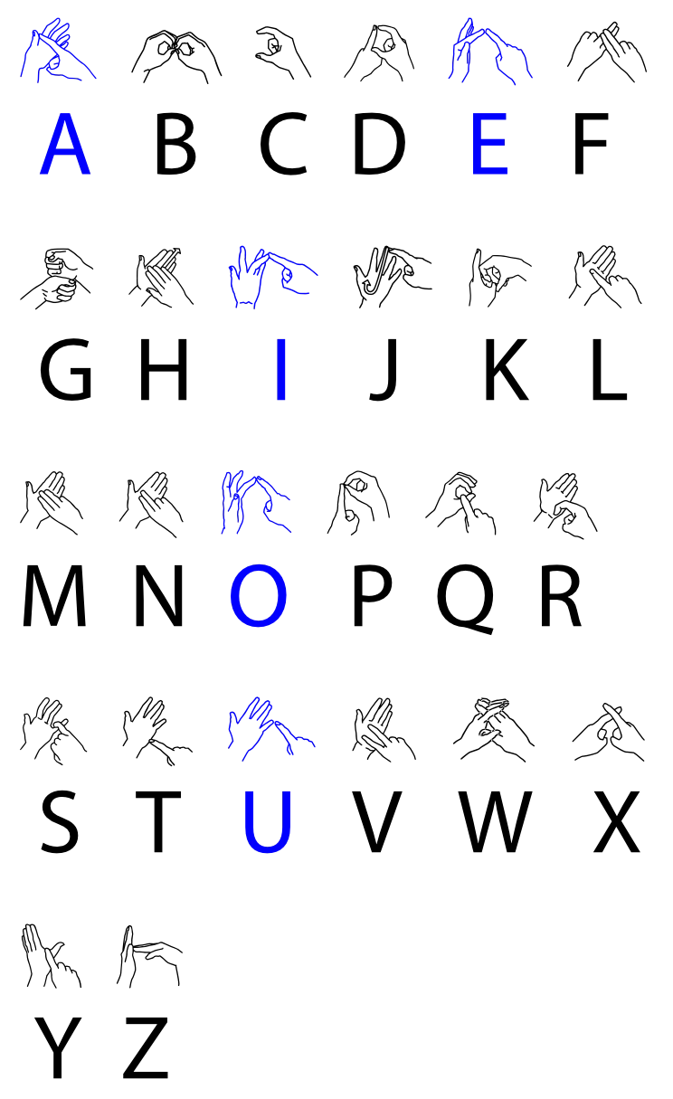
Photo: User:CowplopmorrisTalkContribs at en.wikipedia., CC BY-SA 3.0, via Wikimedia Commons
Most motion designers have had the request arrive late: 'Can we add a BSL interpreter in the corner?' The edit is locked. The brand animation is busy. The lower third already occupies the only clean patch of screen. An interpreter gets squeezed into whatever remains, and everyone calls it accessible.
British Sign Language is not a caption track with elbows. It is a visual language built from handshape, placement, movement, eyeline and facial expression. If a campaign is going to include signing, the frame has to be designed for it from the start. That means treating the interpreter as a primary visual track, not a post-production sticker.
The signing zone is a stage, not a corner
A useful starting point is to stop thinking in terms of a little box. Signing needs width. Hands travel. Elbows matter. The face carries grammar. A tight square in the bottom right might fit a head-and-shoulders crop, but it can clip gesture and flatten expression.
Reserve a stable vertical column or a clean side panel in the layout. Define it as a percentage of frame, not a pixel value, so it survives the journey from 16:9 broadcast to 9:16 social. Mark it on the storyboard and on every template. Give the interpreter headroom, torso and hand space. Keep the background inside that zone calm and consistent.
This is especially important in UK campaigns that travel across multiple platforms. A layout that works on a TV screen can collapse on a phone. The signing zone should survive the crop, not be rebuilt after it.
Motion has a volume knob
The biggest conflict is rarely the interpreter's box. It is everything happening around it. Looping brand patterns, kinetic type, fast cuts and high-contrast tickers all compete for attention. Signing depends on reading hands and face, so visual noise near the interpreter is not just untidy. It makes the language harder to follow.
Turn the volume down in and around the signing zone. Use static plates, slow gradients or gently moving textures instead of strobing graphics. Keep lower thirds, logo bugs and call-to-action buttons away from hands and face. If the brand system insists on movement, let it happen elsewhere in the frame.
Pacing matters too. BSL has its own rhythm and grammar. An interpreter needs time to finish a thought. If the voiceover is dense and the edit cuts every second and a half, the signing will be fighting the timeline. Build breathing cuts. Hold shots. Avoid cutting away mid-sentence. Provide the script, glossary and final timings early so the interpreter and BSL consultant can work with the edit rather than against it. Captions are a companion, not a replacement.
The face is not a margin
Facial expression is part of the language. Cropping the top of the head or the chin is not a minor framing issue. Placing a logo over the interpreter's face is worse. So is a grade that flattens skin tones or a background that creates distracting contrast behind the hands.
Light the interpreter consistently, match the colour temperature to the rest of the film, and check the result on a phone as well as a grade-one monitor. Keep the eyeline clear. Avoid particles, lens flares and face-tracking effects in the signing zone. The goal is not to make the interpreter invisible. It is to make them easy to watch.
Put accessibility review on the schedule
The most common failure is procedural. BSL is added at the end, when there is no time to change the layout. A better workflow puts accessibility review at the same level as legal review or sound mix.
At brief stage, decide whether BSL is required, who the audience is and where the film will run. At storyboard, draw the signing zone and test it with a placeholder silhouette. At animatic, check pacing with an interpreter or BSL consultant. At picture lock, record the interpretation against the final timing and leave handles. At online, protect skin tones, contrast and the quiet zone. At QC, watch the film with a BSL user or consultant, not just a checklist.
That last step is not a box-ticking exercise. It is the difference between a film that includes signing and a film that actually works for signing.
A small spec that travels
If a brand uses BSL regularly, write the rules down. A one-page motion spec can cover the signing zone as a percentage of frame, exclusion zones for text and logos, maximum motion intensity near the interpreter, caption placement, background contrast and who signs off accessibility.
The BSL Act 2022 gave the language more legal recognition. It did not make every brand video accessible by magic. That still comes down to production decisions: where the frame is divided, how long a shot holds, how loud the graphics are.
Accessibility is often framed as a constraint on creativity. In practice, it is just another design parameter, like aspect ratio or loudness. Plan for it early and the layout gets cleaner, the pacing gets sharper and the film gets easier to watch for everyone. If hands need negative space, give it to them.